Reclaiming Rocky Mountain Refreshment
Brand Packaging Redesign
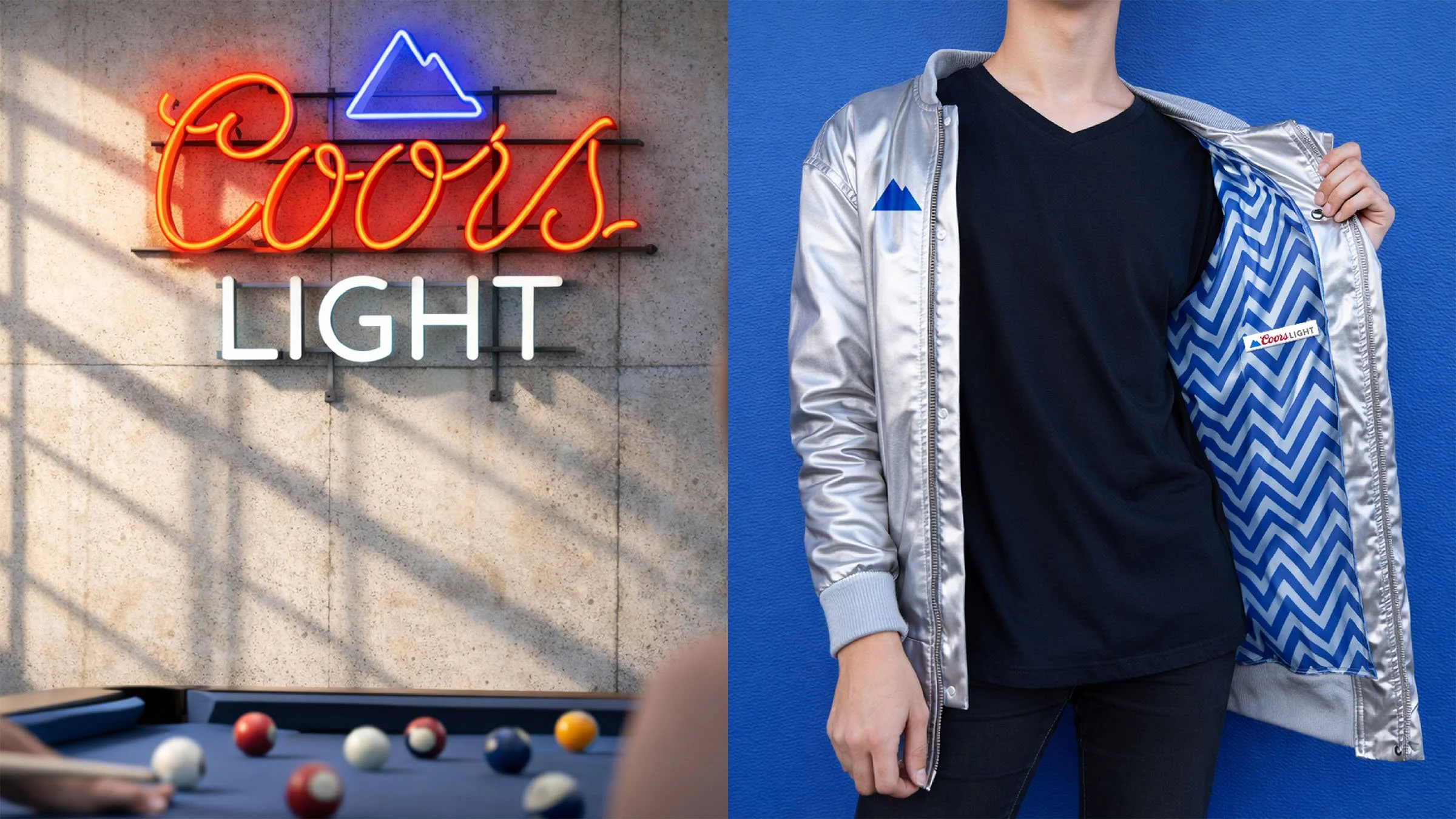
Visual Identity • Packaging • Brand Standards • Merchandise
As sessionable hard seltzers surged into the category, Coors Light faced a critical challenge: defend its position as the icon of cold refreshment without losing the heritage that made it the nation’s No. 2 beer. The opportunity wasn’t reinvention, it was amplification.
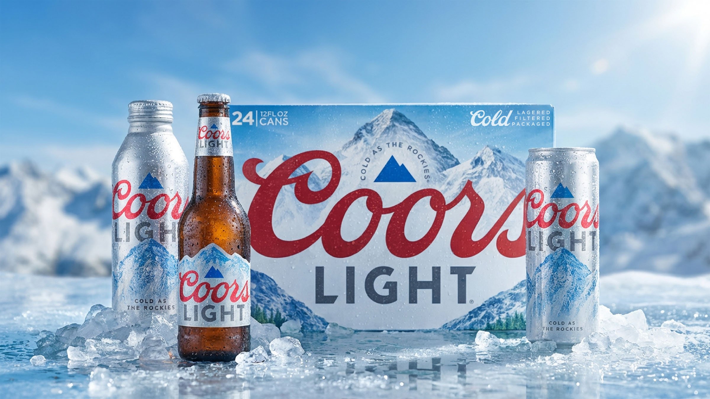
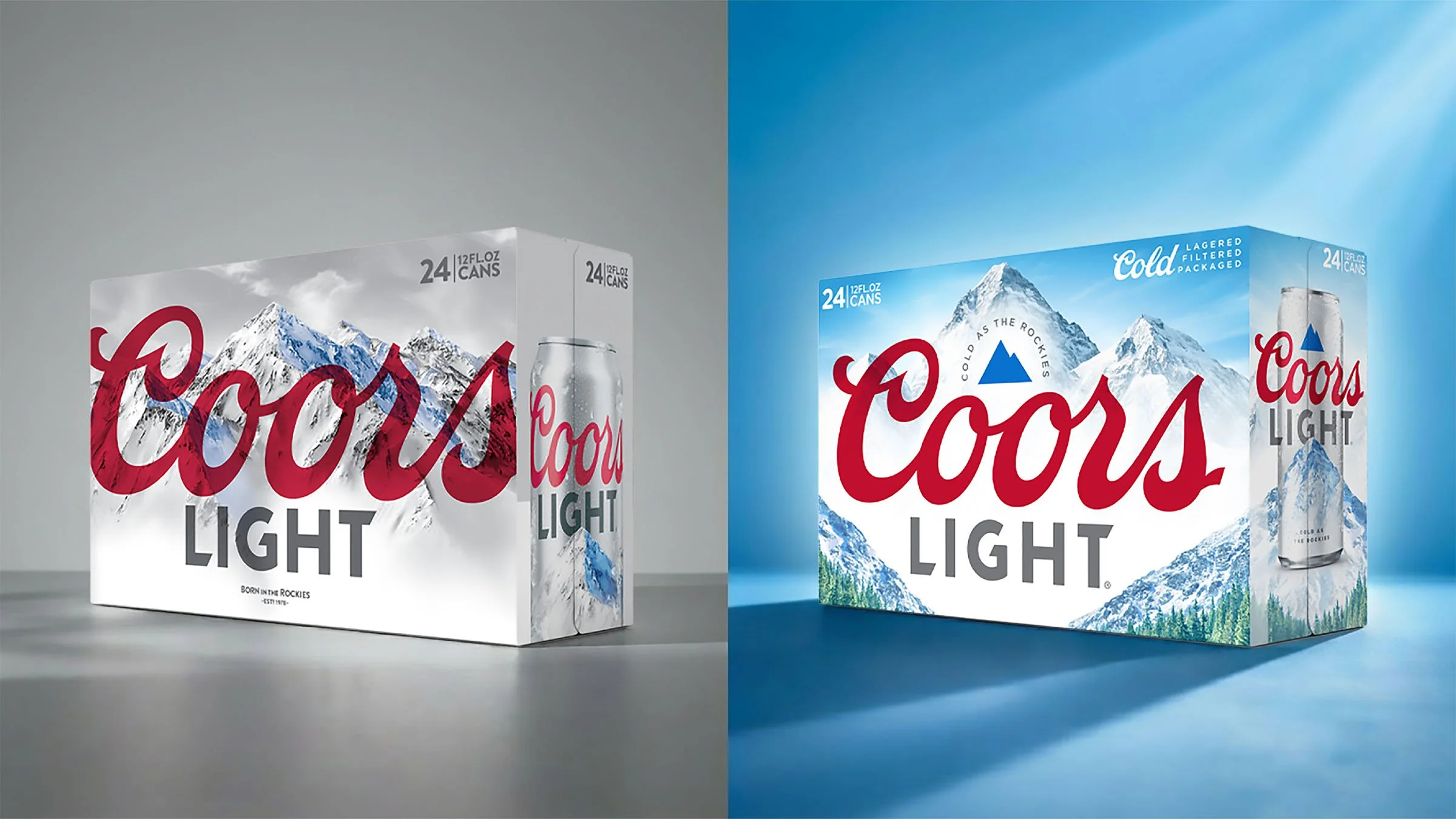
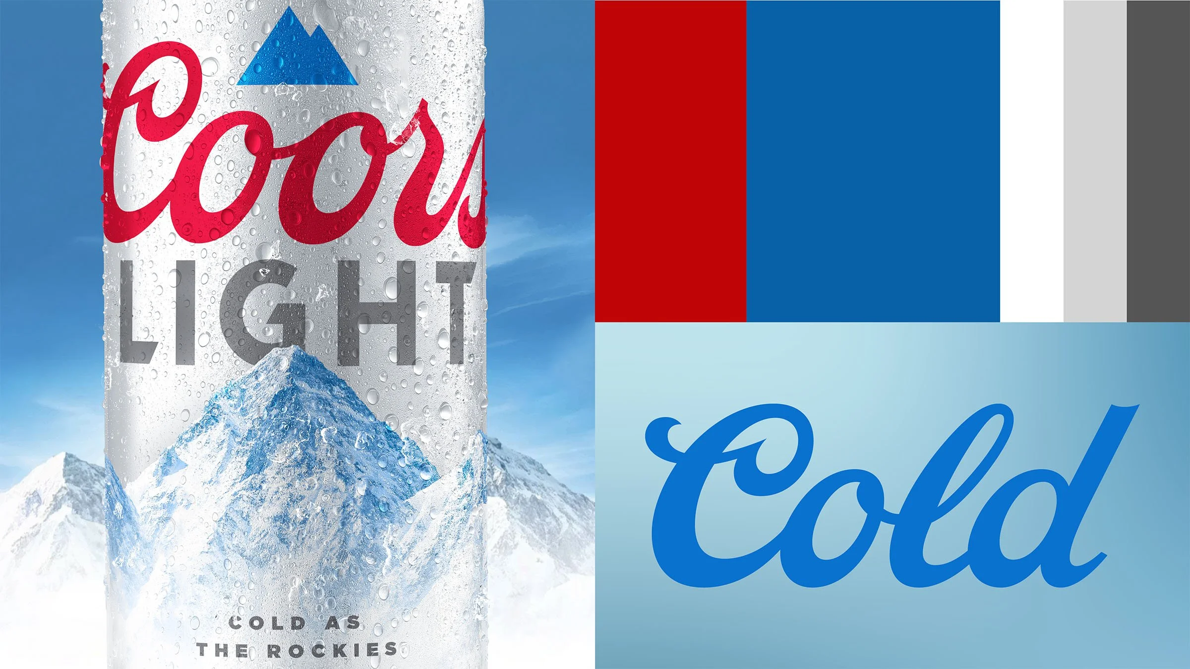
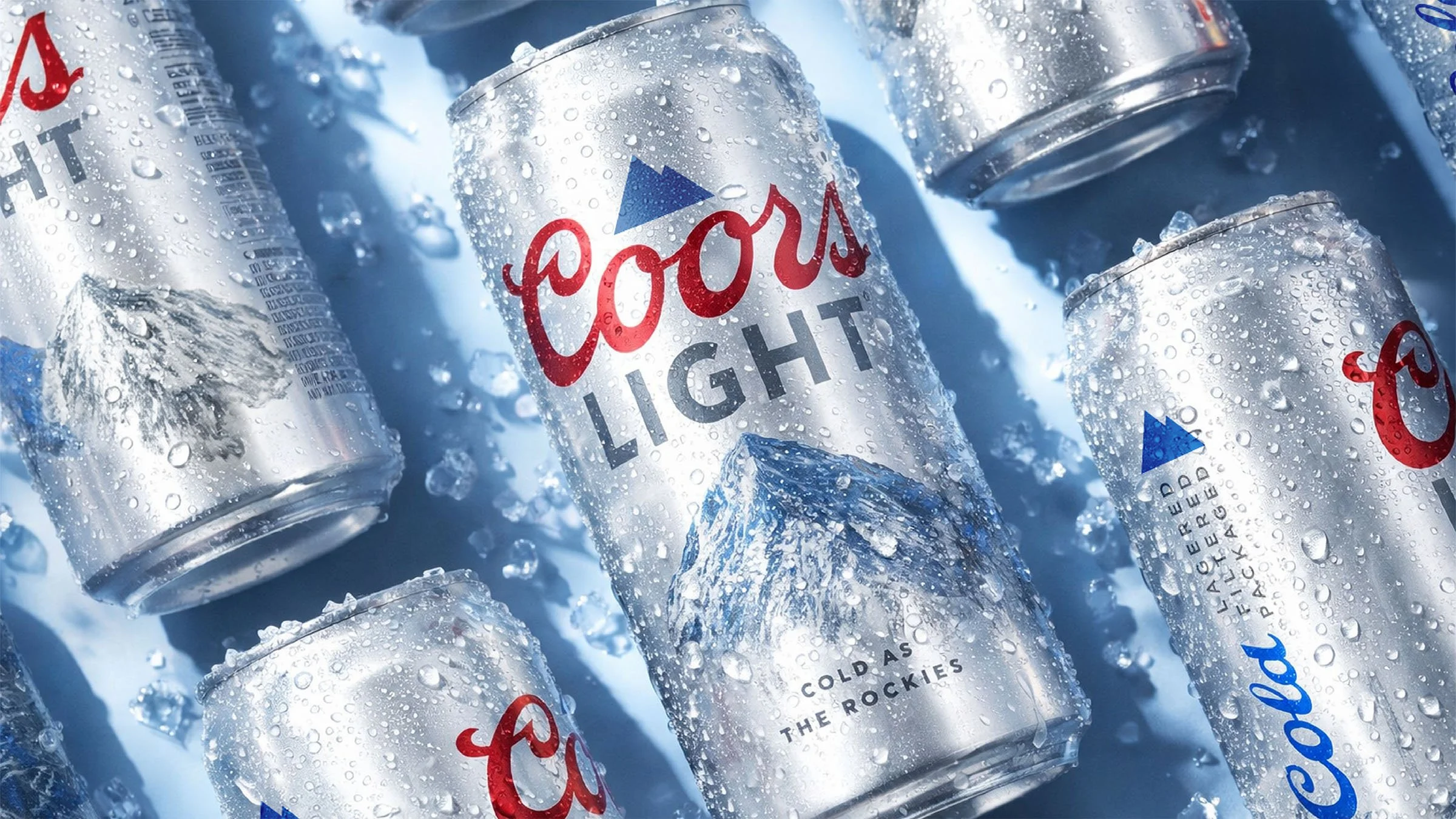
Our redesign sharpened the brand’s Rocky Mountain DNA, transforming its most recognizable assets into a more powerful, modern system. Brighter skies, a deeper alpine valley, and a refined mountain mark created a visual language that feels crisp, optimistic, and unmistakably Coors Light. The iconic Coors script remained, but the landscape expanded, adding scale, depth, and drama that billboard across every secondary pack. Anchored in the brand’s “Made to Chill” platform, the mountains became more than scenery, they became a visual invitation to escape everyday pressure. By evolving, not replacing, its distinctive assets, the redesign strengthened recognition while reigniting relevance. The result: a colder, bolder package that reasserts Coors Light as the category’s definitive symbol of chill.
Results
Light grew 6.0% in off premise in 2020.