Jif Brand Redesign
Spreading Beyond the PB&J
Brand Architecture • Brand Identity • Visual Identity • Equity Packaging • Brand Standards
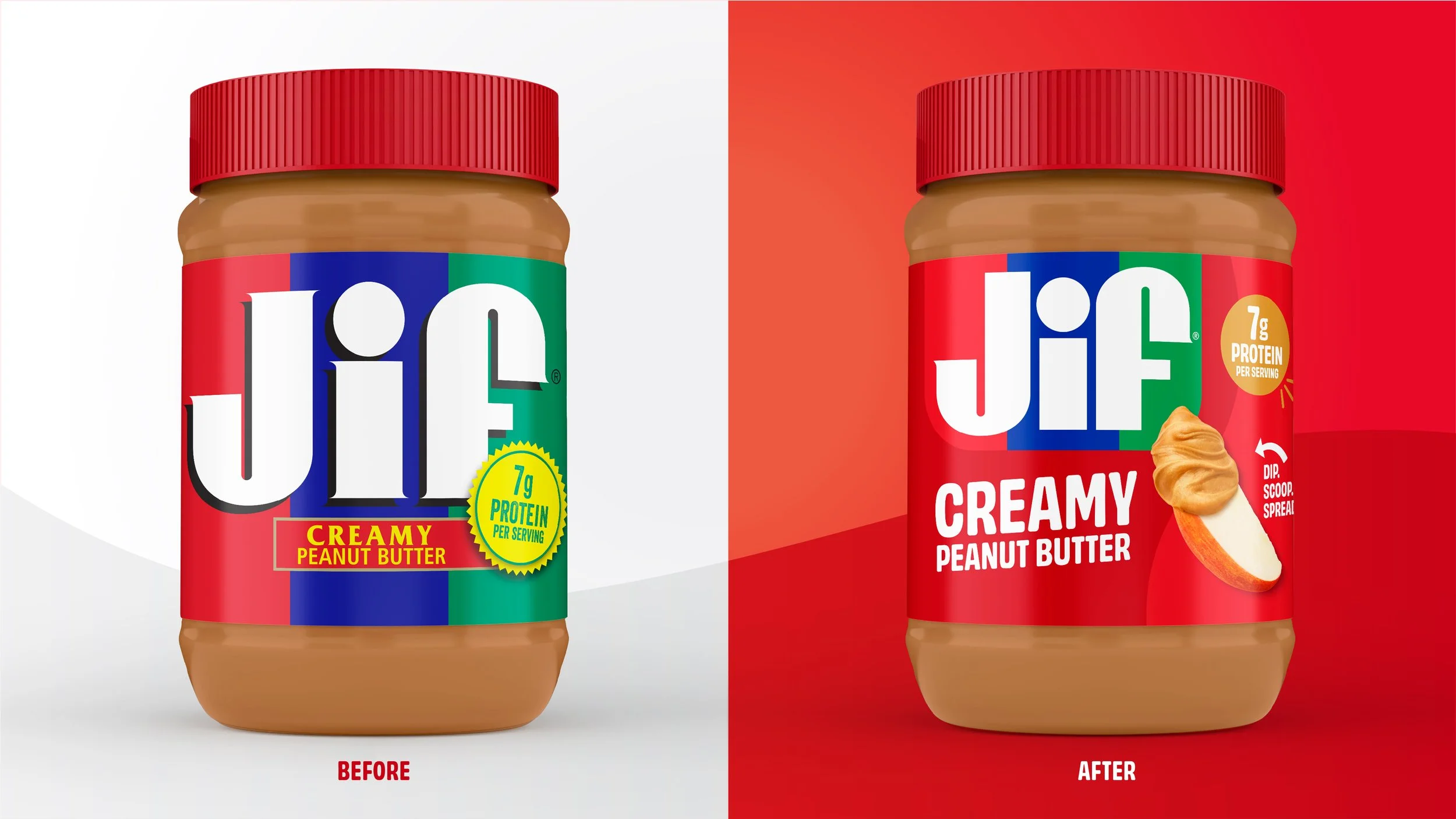
After more than 30 years without a packaging update, Jif® saw an opportunity to evolve its identity for the way consumers enjoy peanut butter today. As the category expanded beyond the traditional PB&J into a broader range of everyday snacking occasions, the challenge was to modernize the brand while preserving the distinctive equities consumers know and love.
We started with brand architecture to strengthen the portfolio and create a foundation for future growth. Our proprietary R.I.S.E. analysis then identified the equities to retain, strengthen, introduce, and eliminate, creating a focused path for evolution.
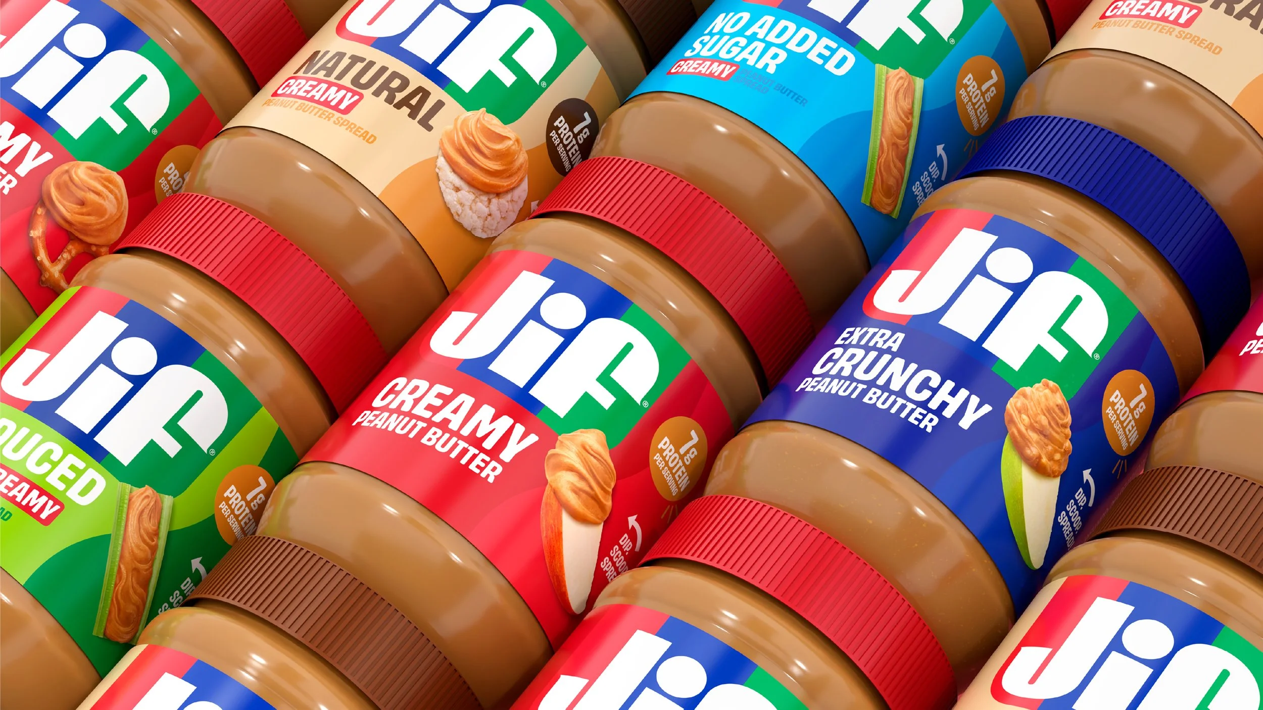
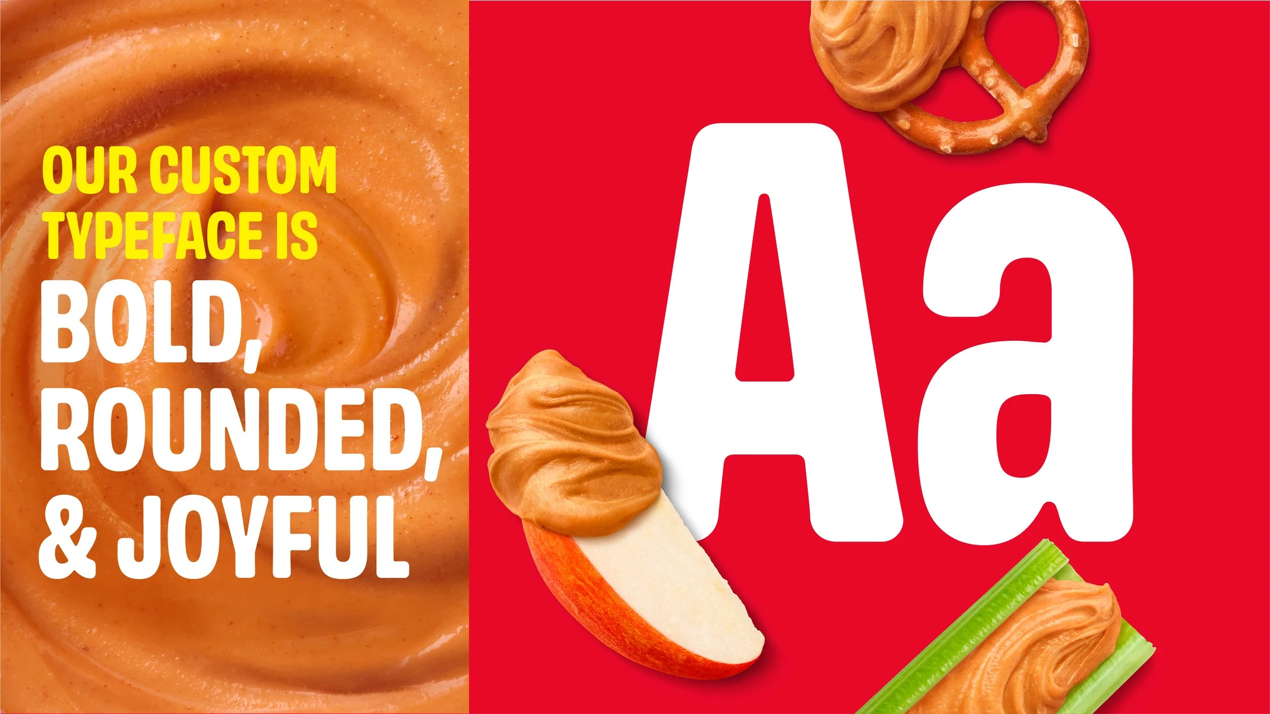
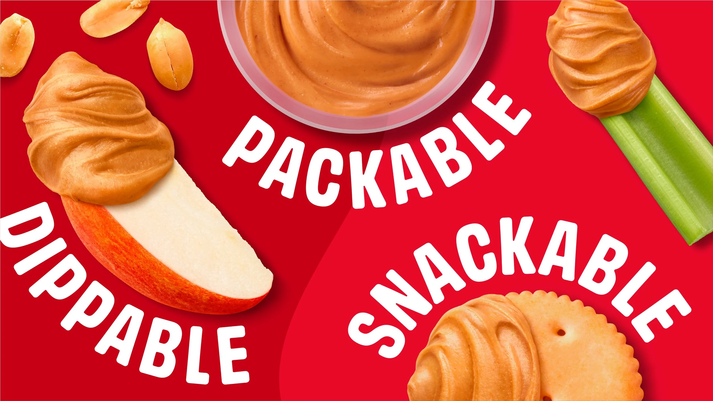
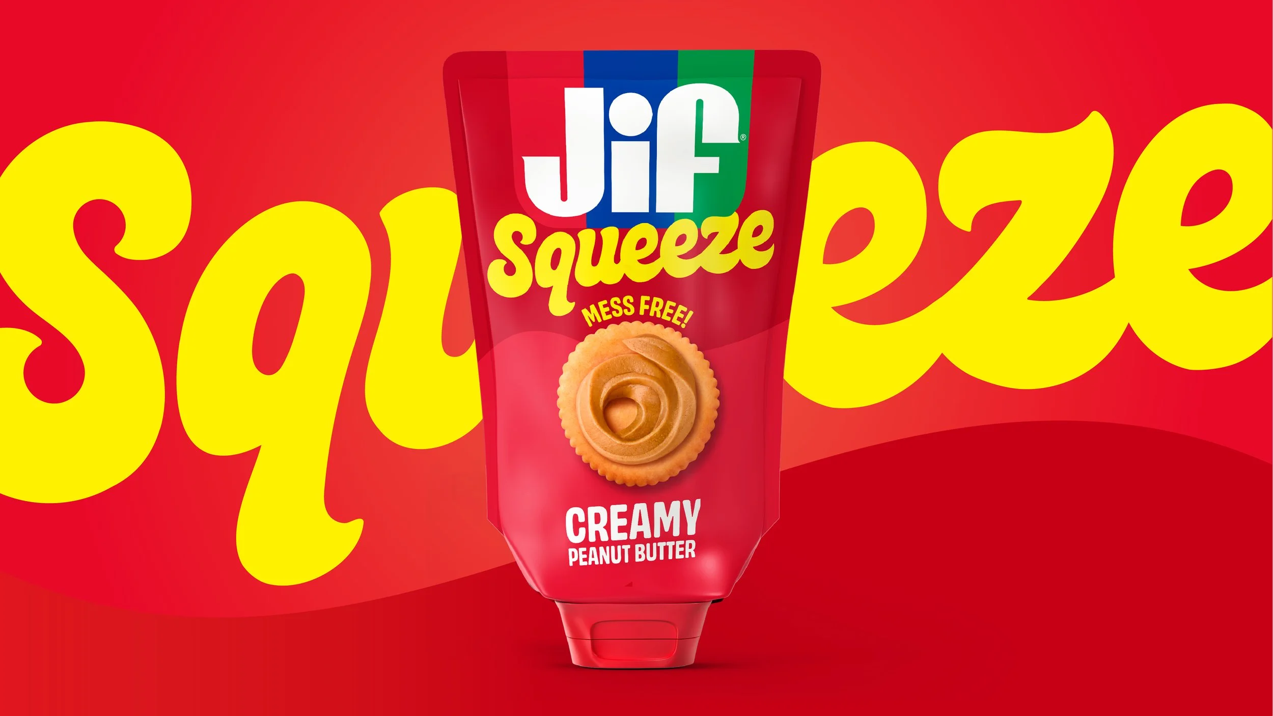
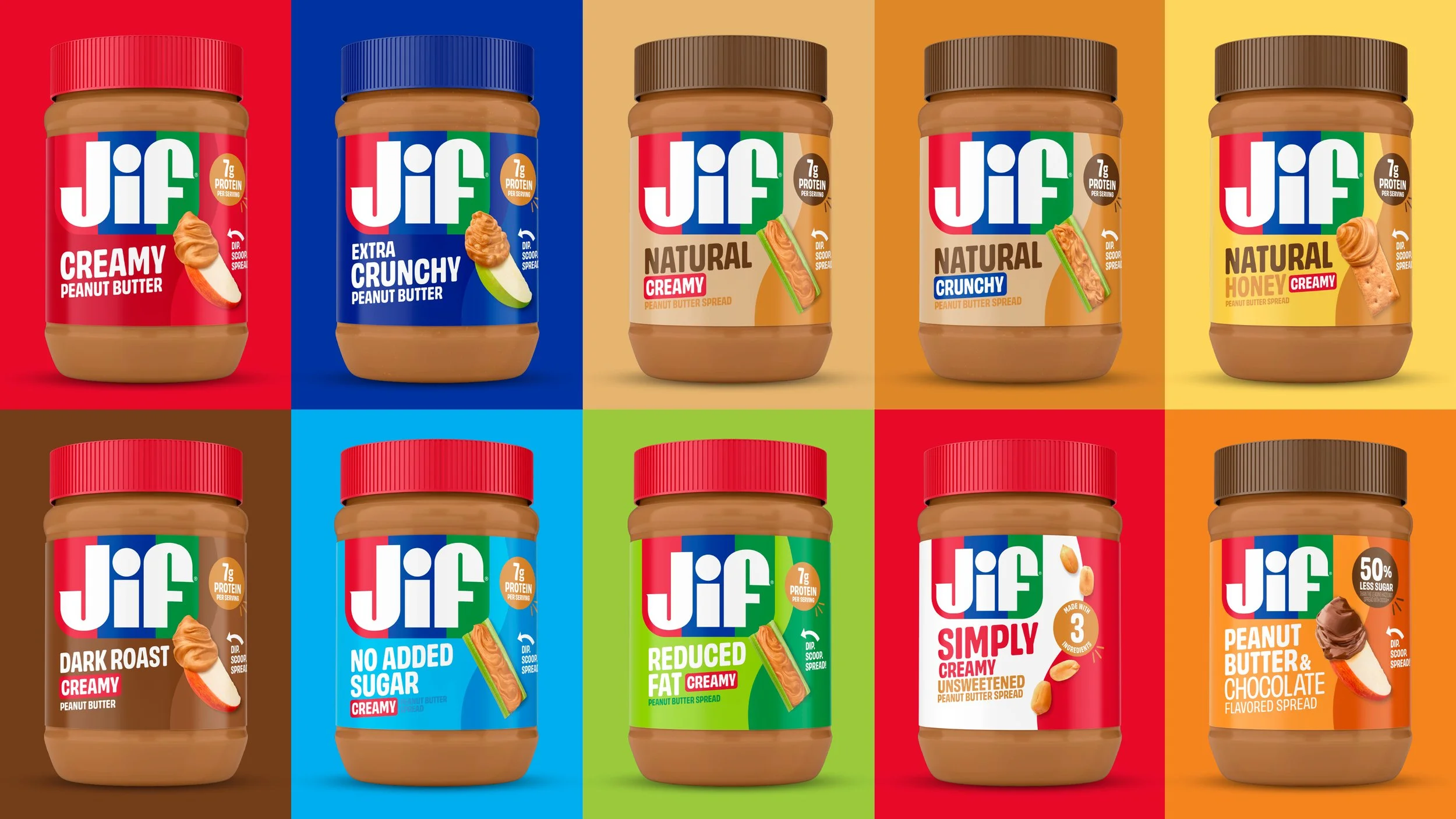
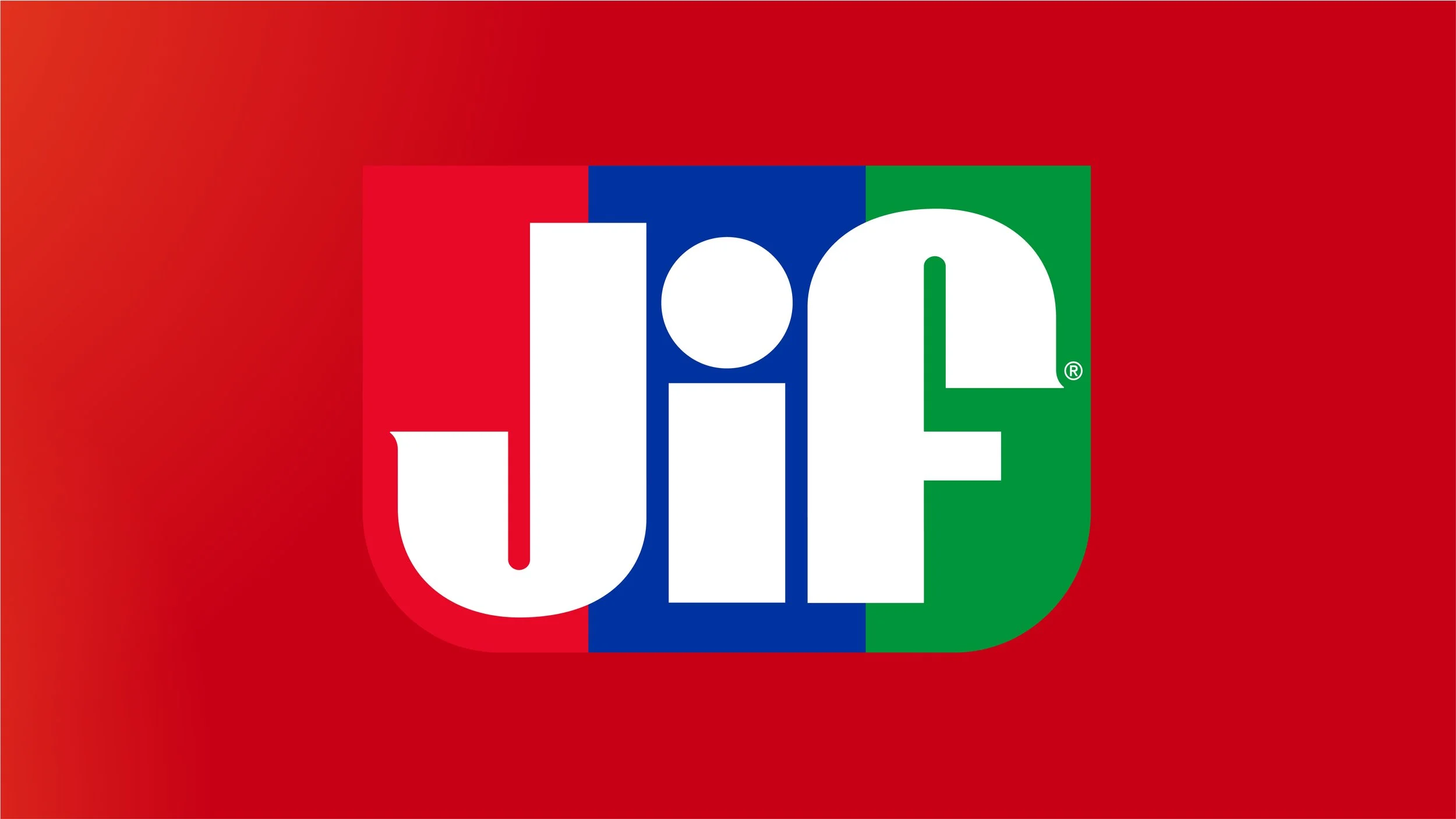
We refreshed Jif’s identity with a cleaner, bolder expression, evolving the signature tri-color banner and removing the dated drop shadow. Most importantly, we made the product the hero. Vibrant, craveable imagery brings apples, crackers, rice cakes, and other pairings to life directly on pack, expanding perceptions of how and when Jif can be enjoyed. The result is a more contemporary packaging system that feels unmistakably Jif while inviting consumers to see peanut butter—and Jif—in more ways than ever before.