Miller High Life Brand Redesign
Embracing the Character while Building Distinction
Brand Identity • Visual Identity • Packaging • Brand Standards • Merchandise
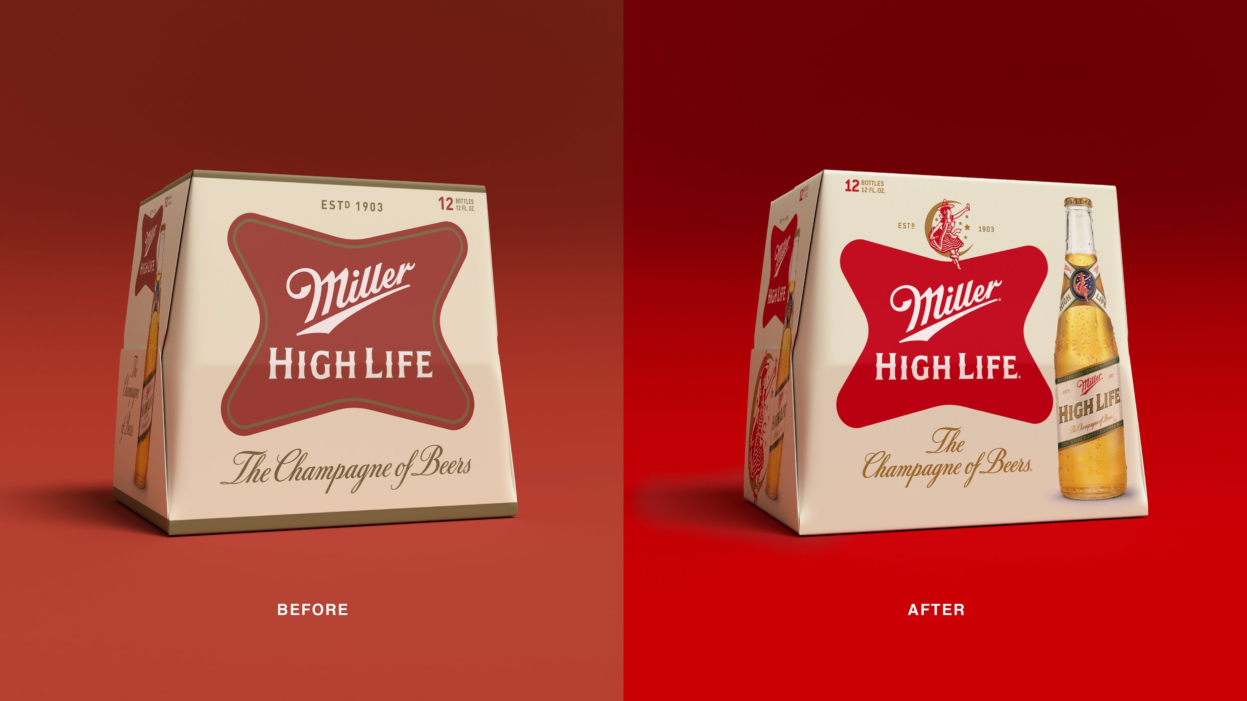
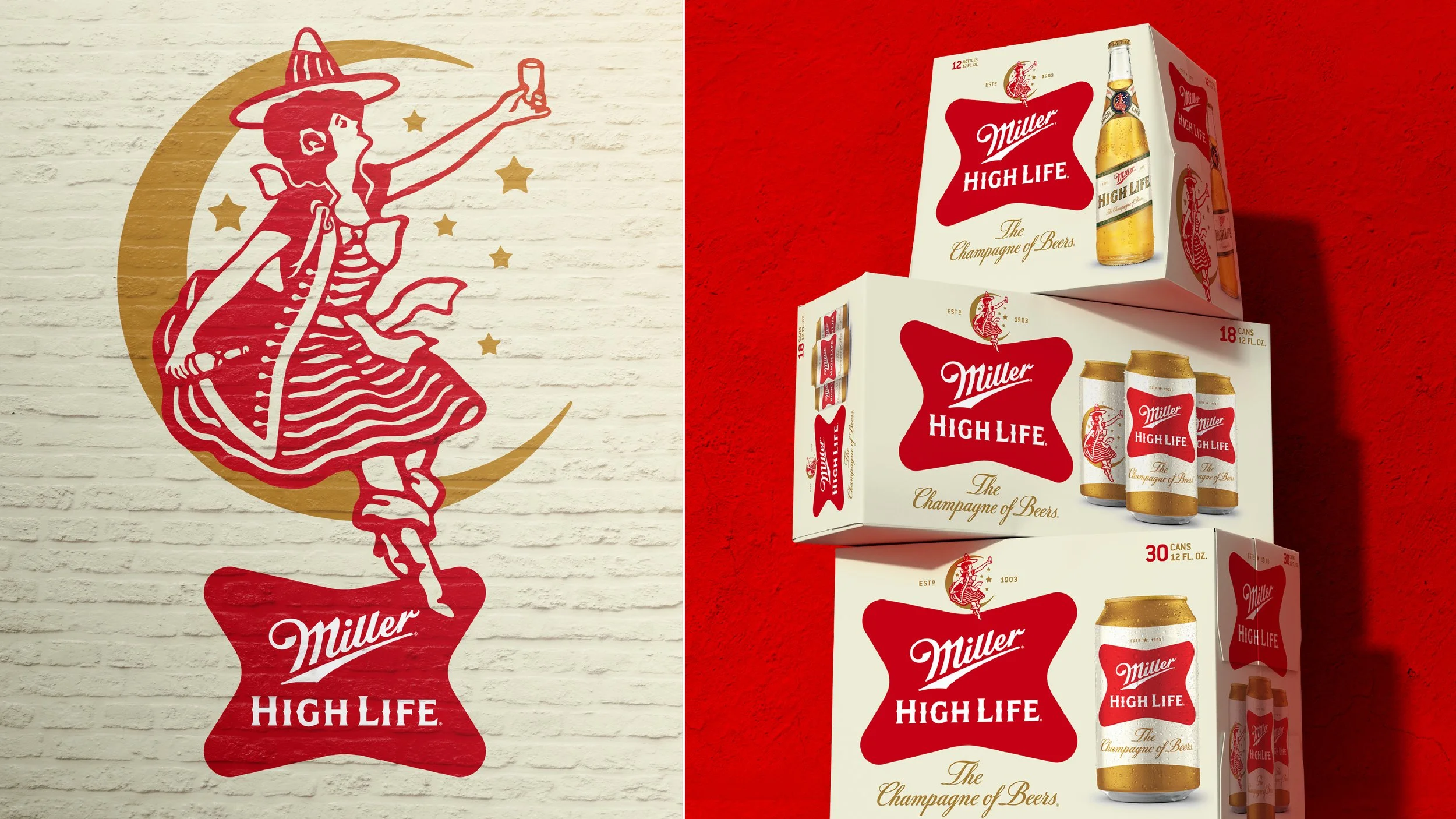
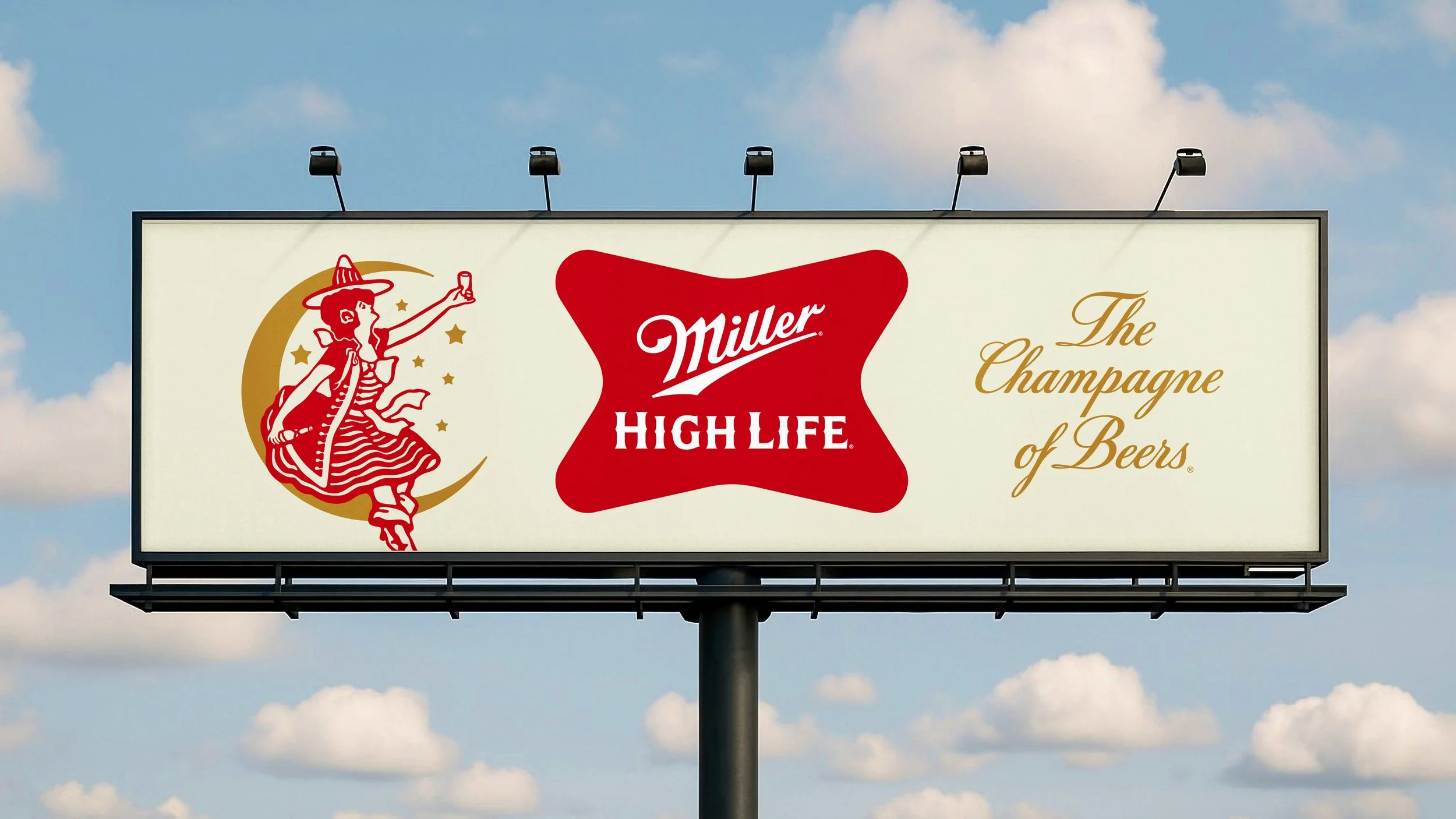
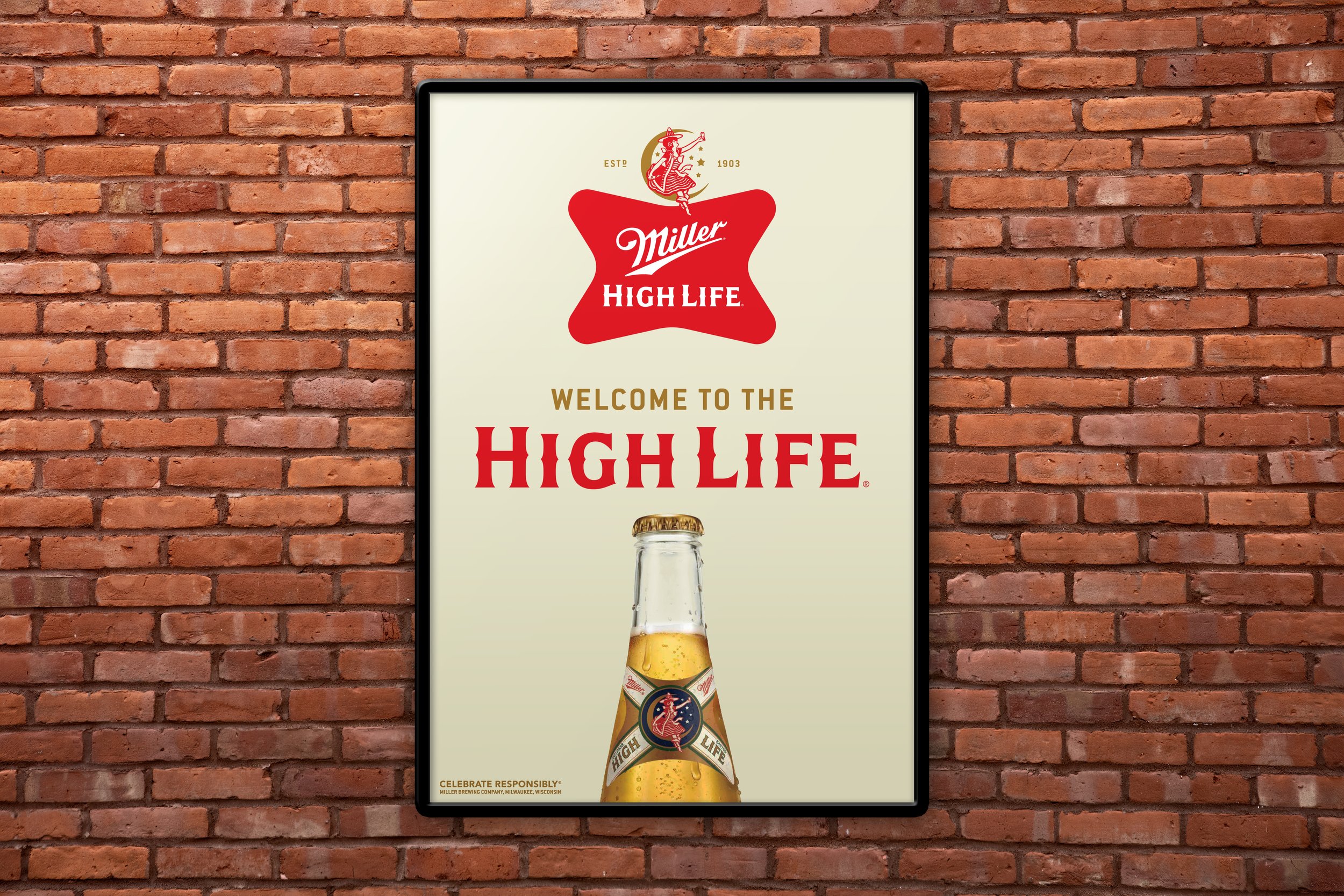
For generations, Miller High Life has been a dive bar fixture and home fridge favorite, beloved for its timeless, unpretentious character. The opportunity wasn’t to reinvent “The Champagne of Beers,” but to sharpen its most iconic equities, strengthening recognition and relevance for longtime loyalists and the next person pulling up a barstool.
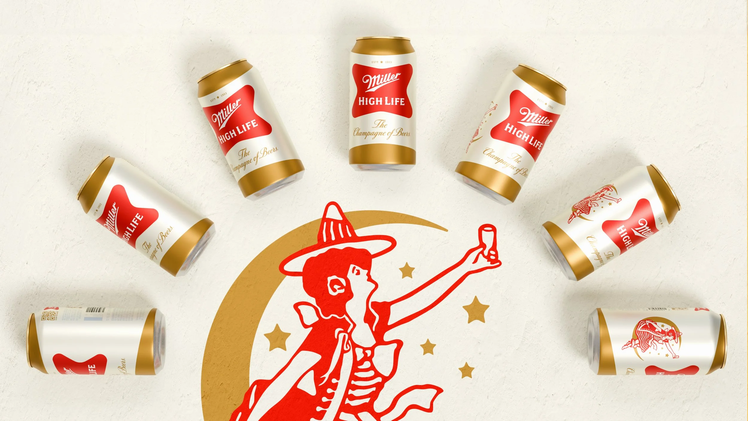
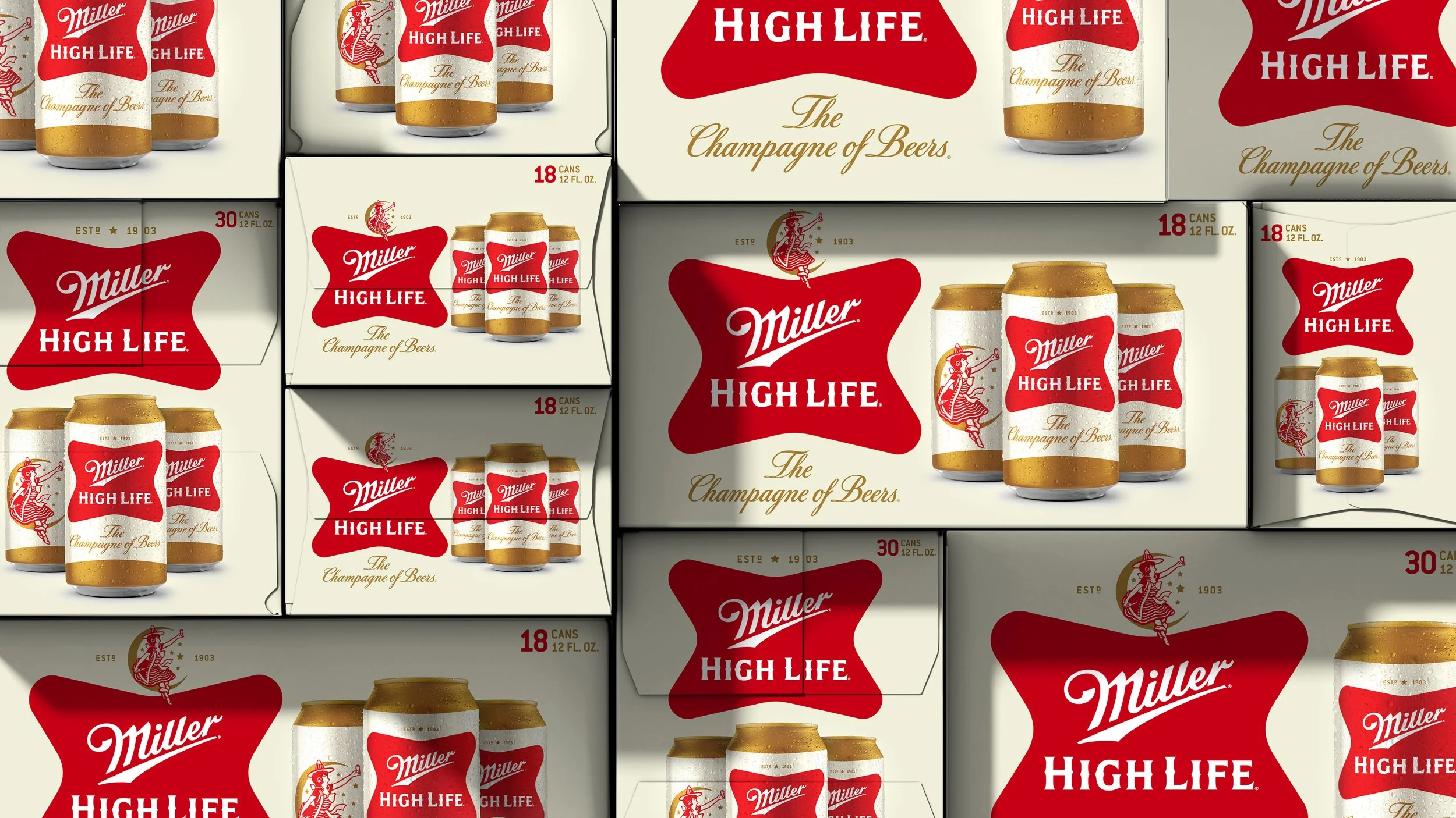
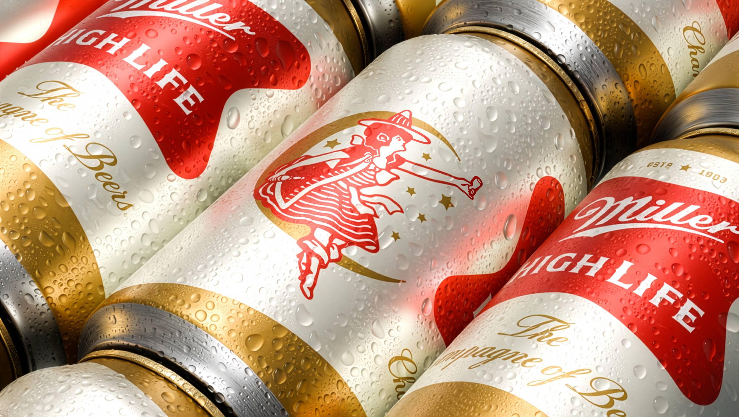
The refreshed identity brings greater clarity and confidence through a crisper signature red, a simplified soft cross logo, and a more prominent role for the Girl in the Moon—one of beer’s most enduring icons. Since 1907, she has appeared everywhere from vintage advertising and neon bar signs to etched mirrors and fan tattoos. Elevating her across packaging and brand communications transforms a beloved symbol into a more powerful and ownable brand asset. The result is a cleaner, more impactful identity that stands out on shelf, celebrates its heritage, and puts High Life’s unmistakable character front and center.