Smucker’s Brand Redesign
Preserving Equity and Amplifying Appeal
Brand Architecture • Visual Identity • Packaging • Photography • Brand Guidelines
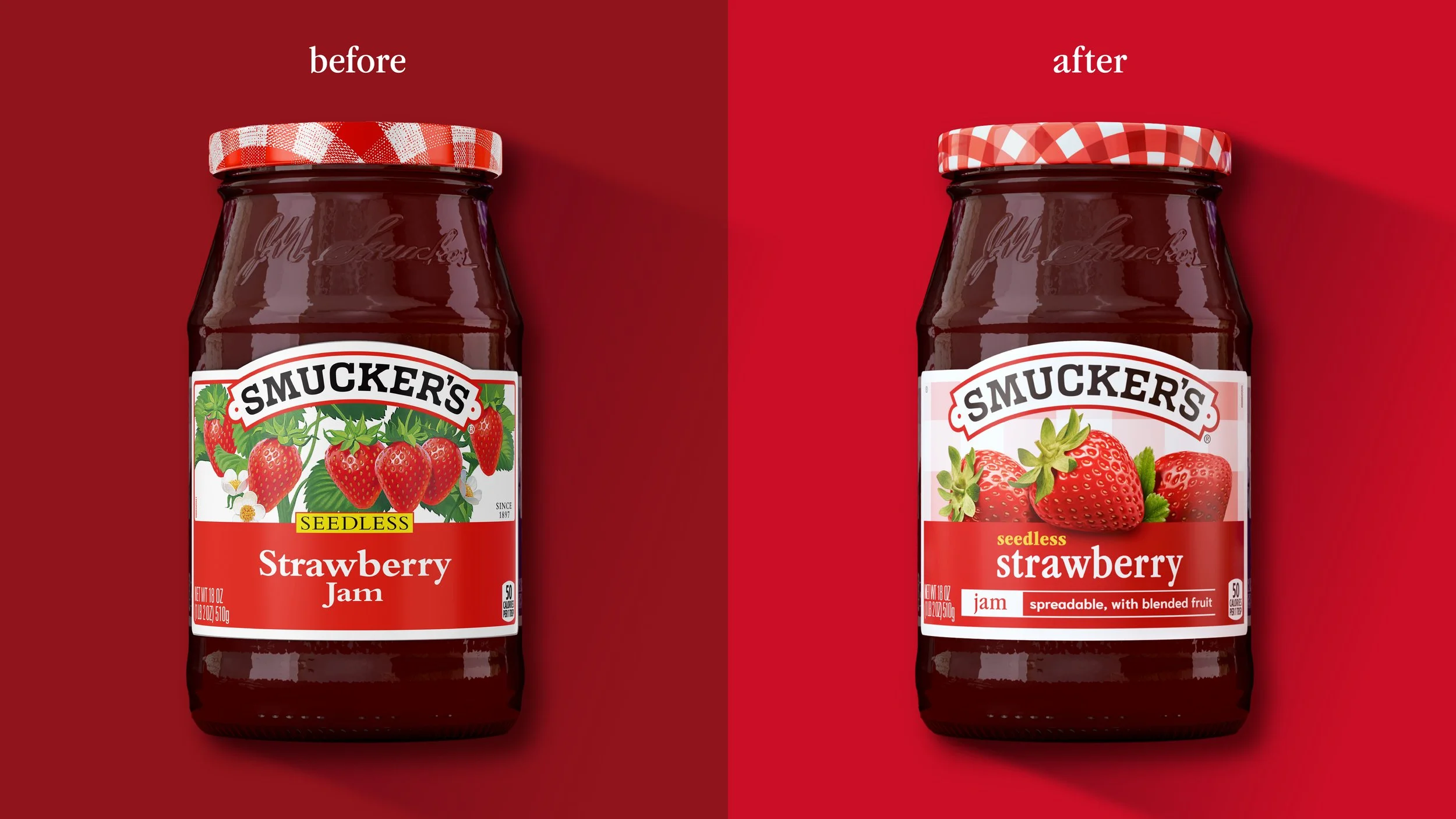
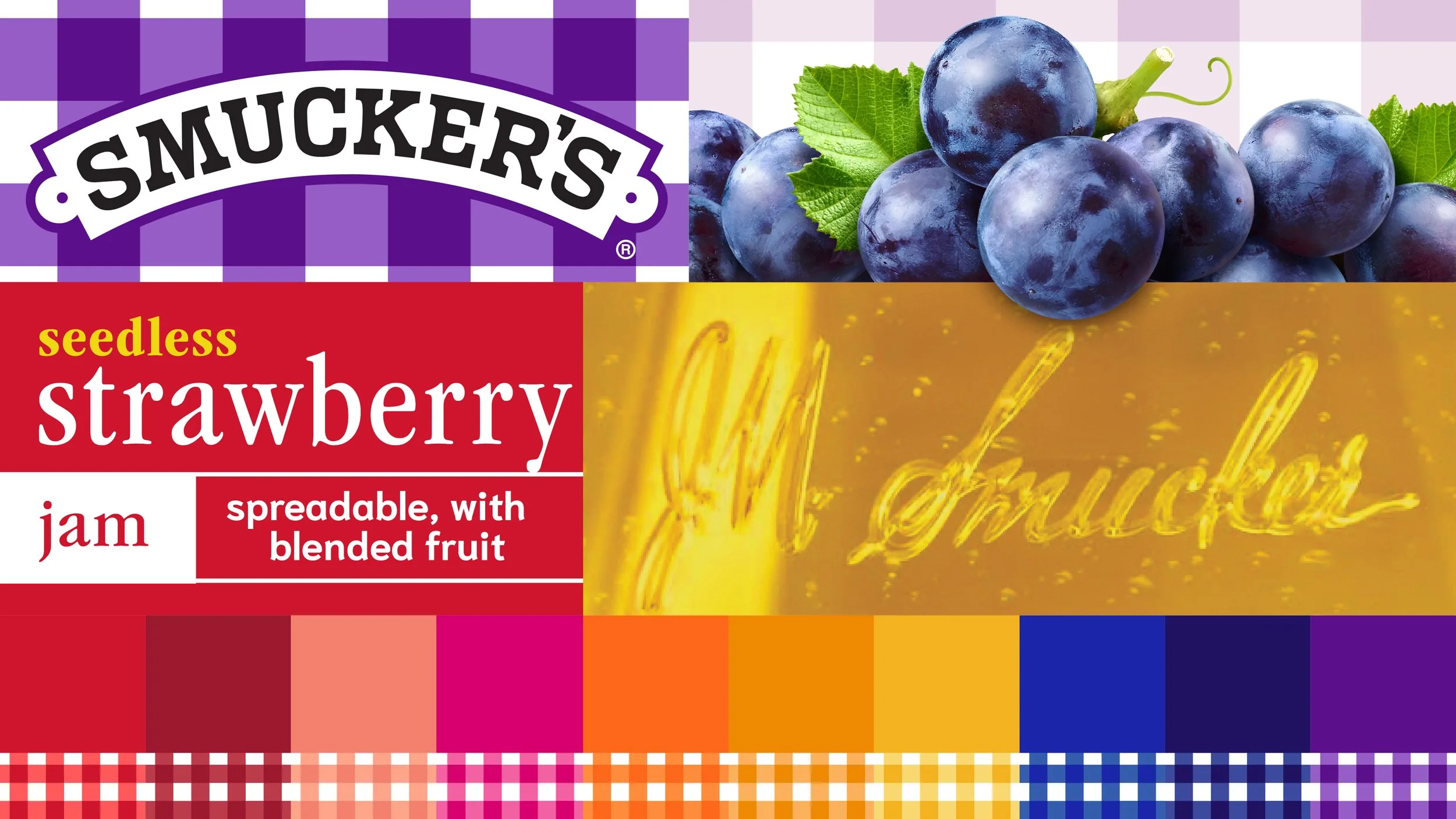
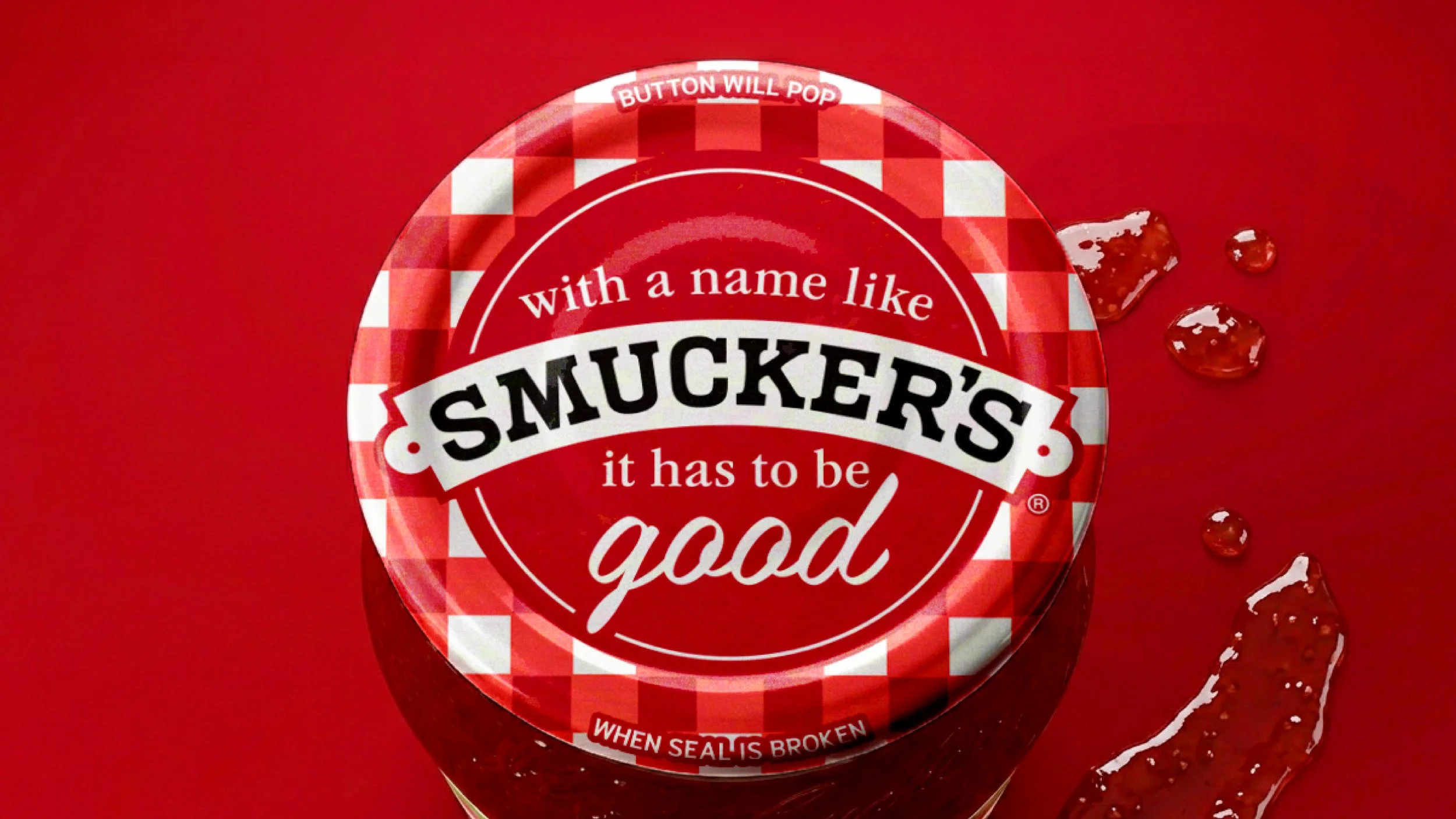
For nearly three decades, Smucker’s packaging remained largely unchanged, anchored by the iconic gingham pattern, heritage cues, and familiar jar silhouette that generations of consumers recognized instantly. As the fruit spreads aisle became increasingly competitive, the brand saw an opportunity to modernize its presence without sacrificing the trust, nostalgia, and recognition that had made Smucker’s a household staple.
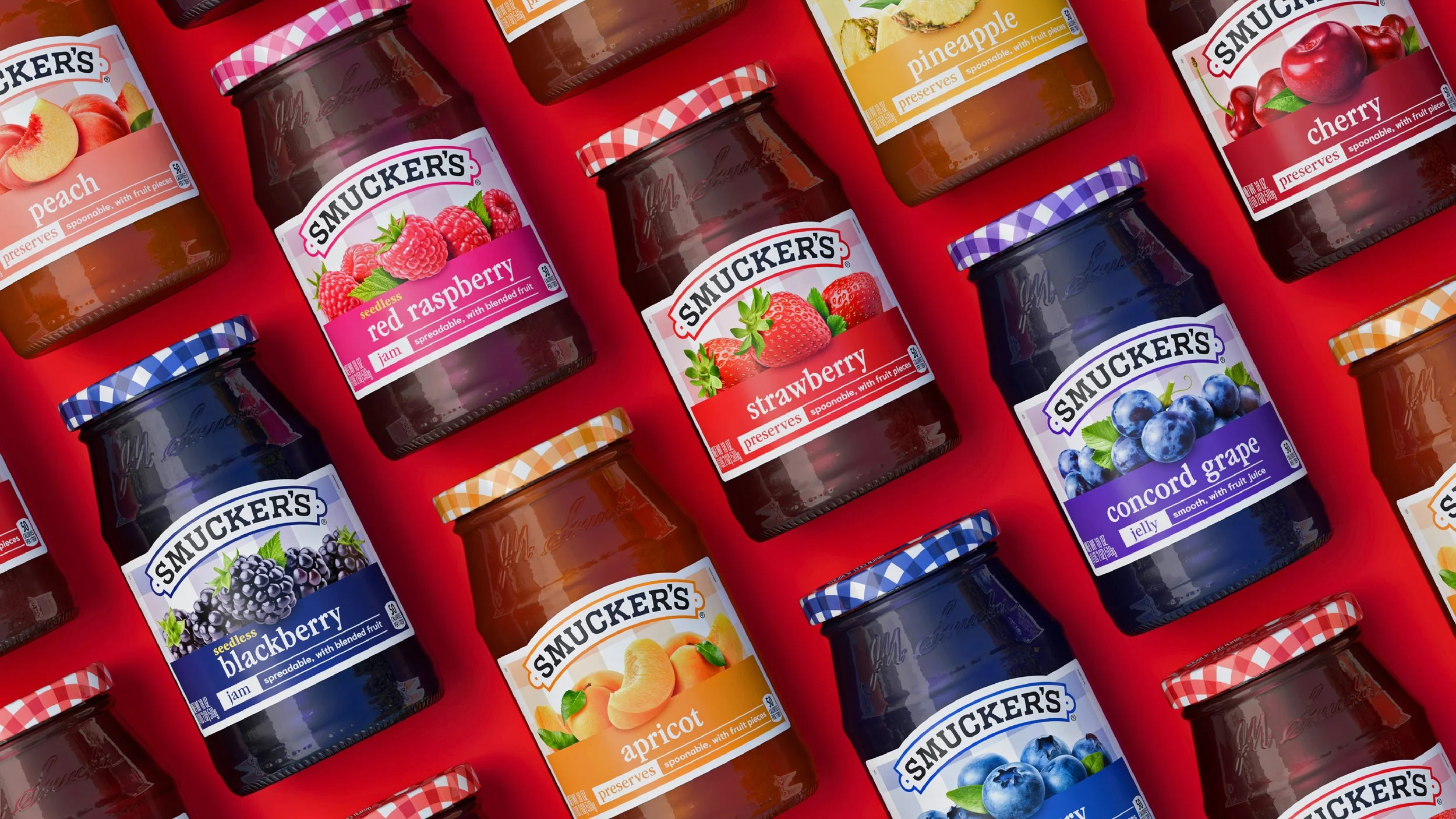
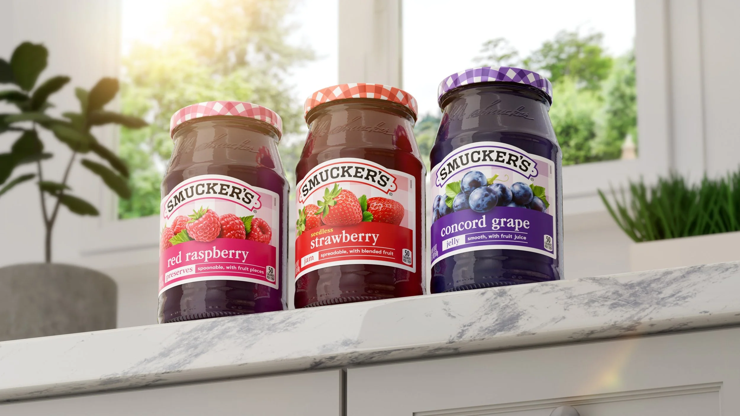
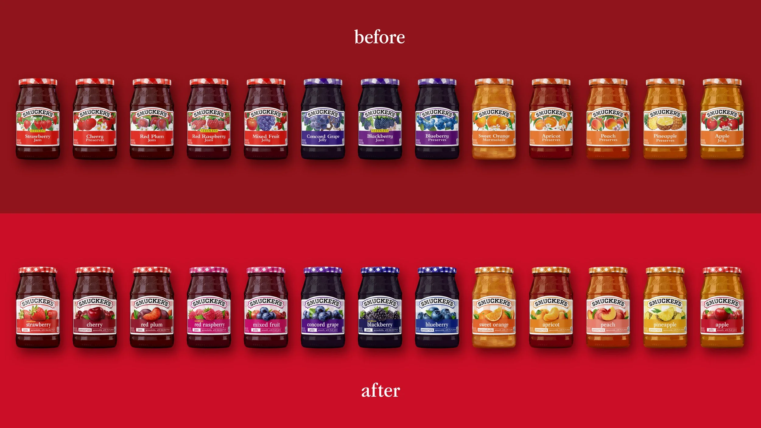
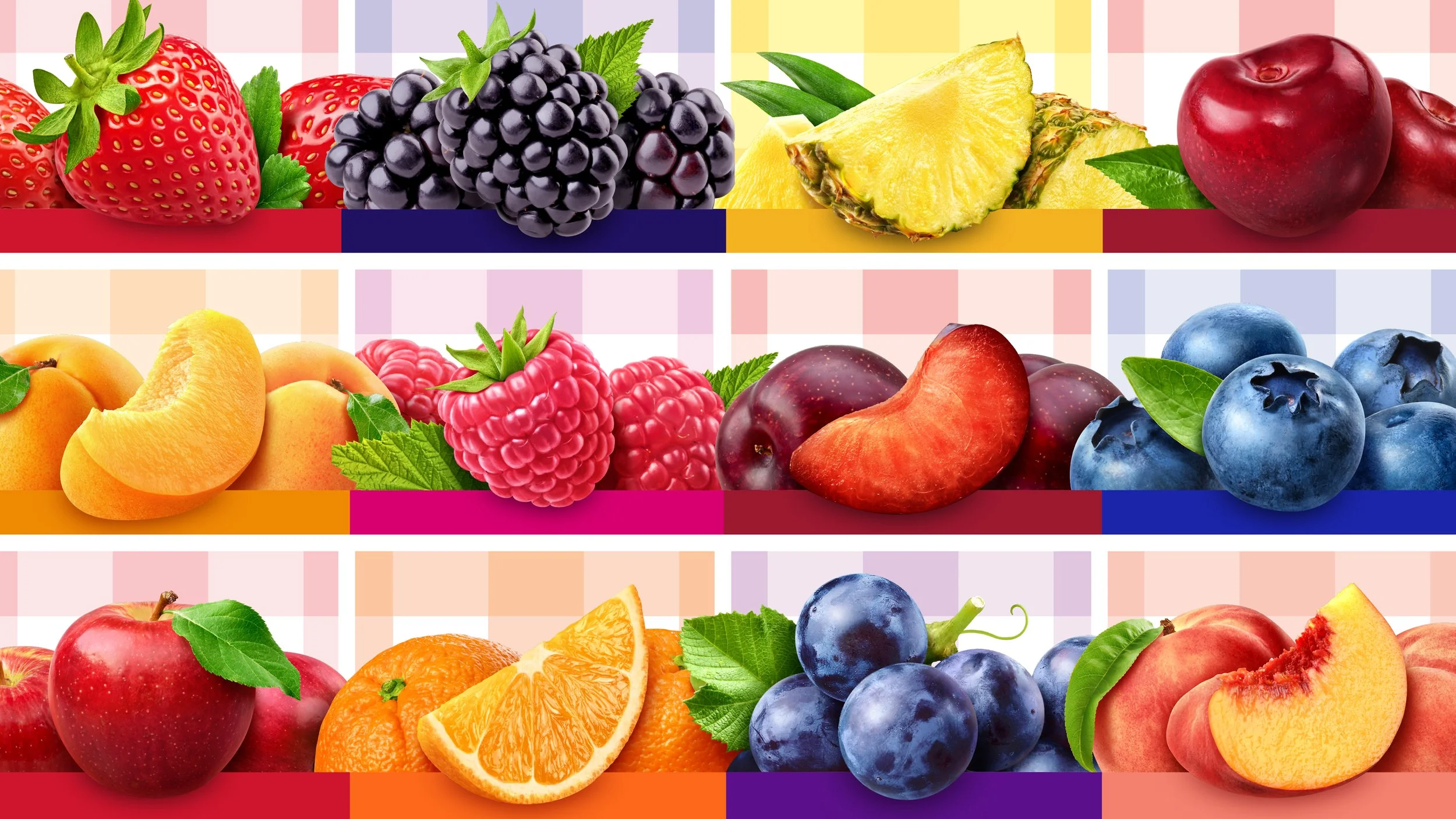
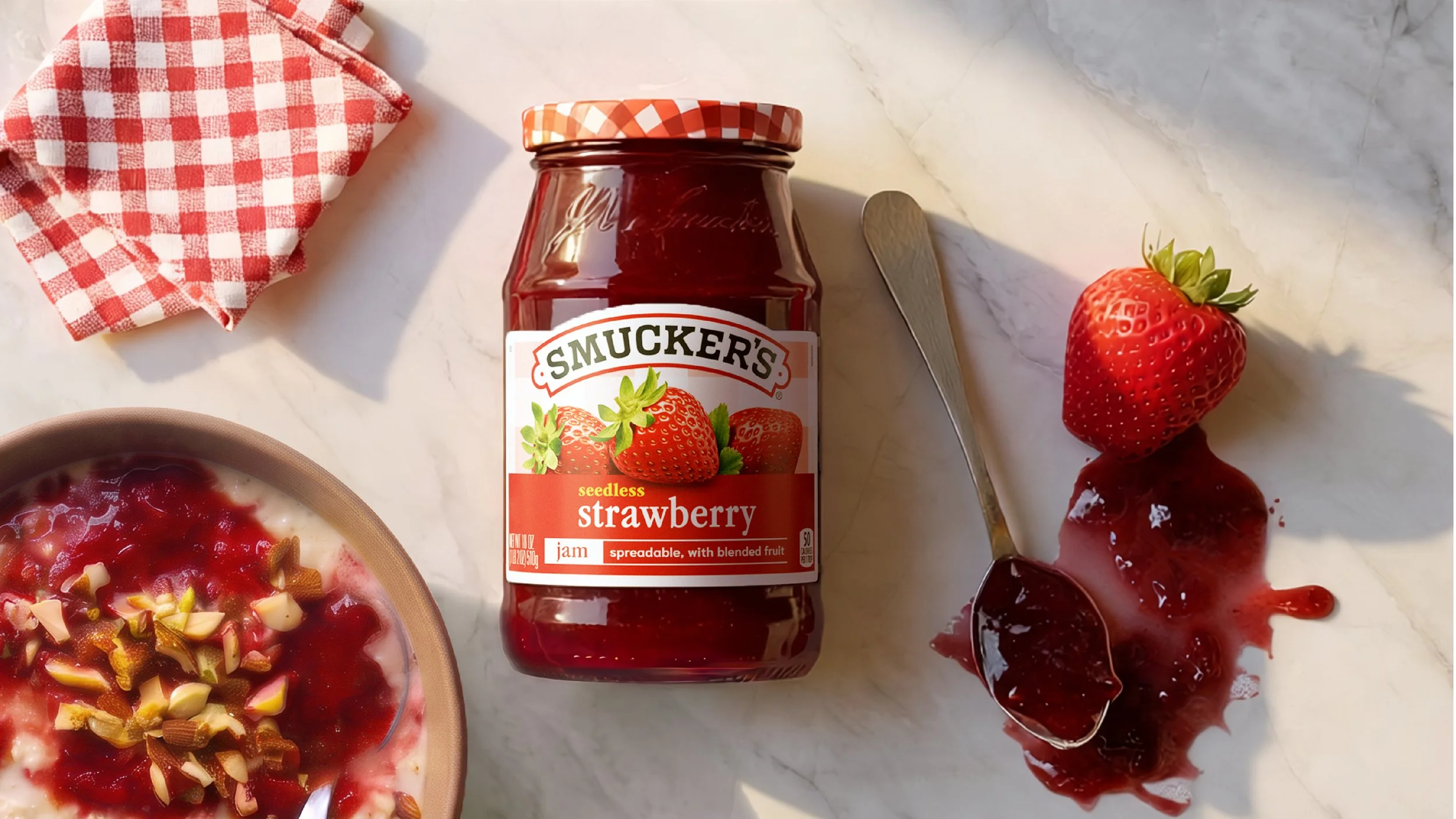
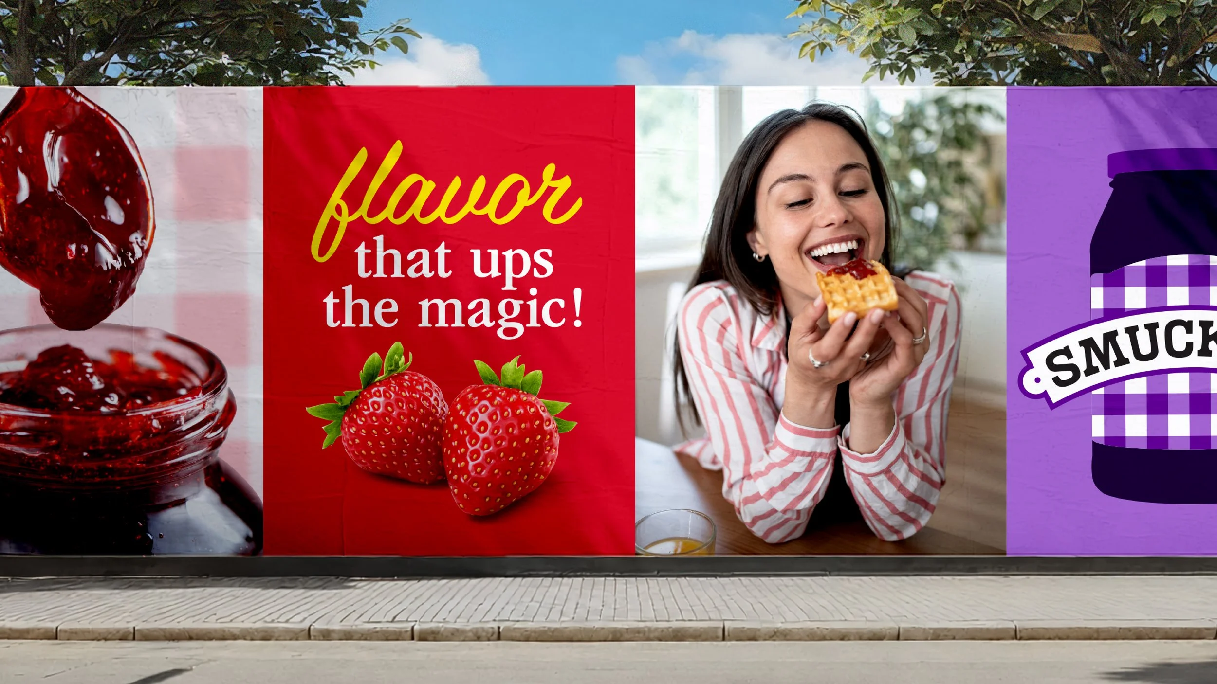
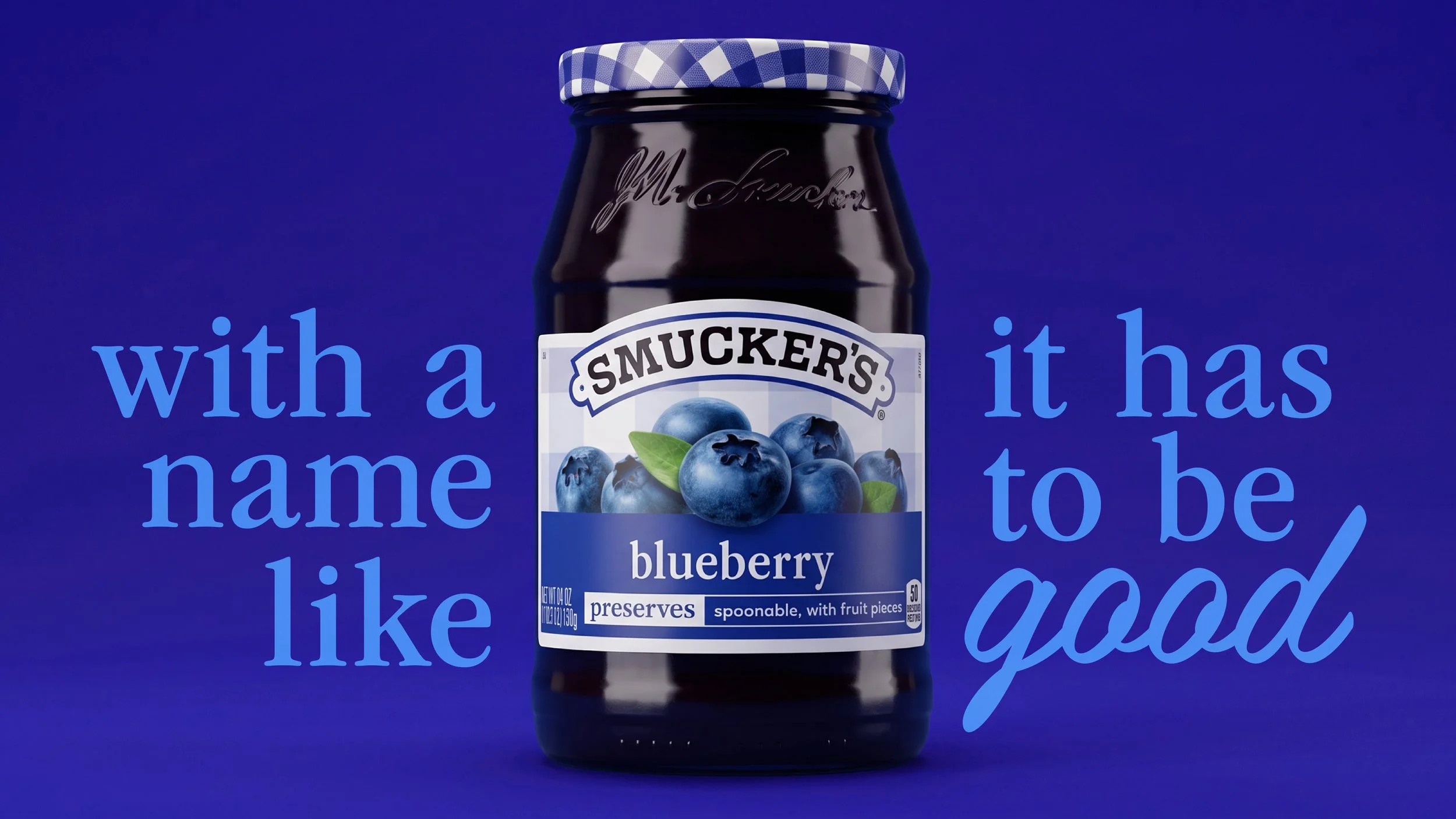
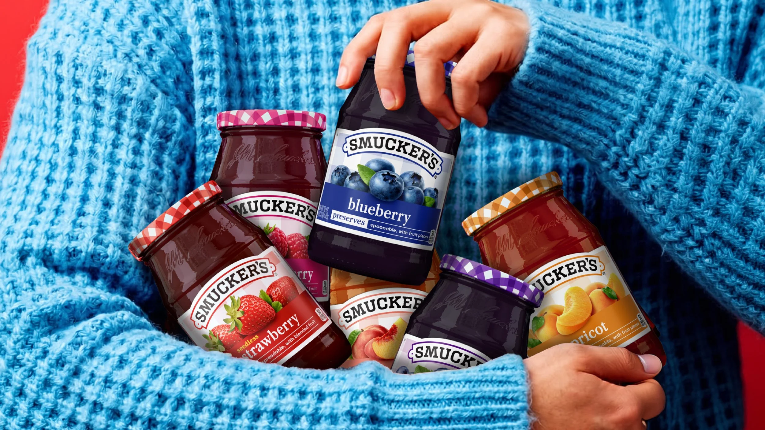
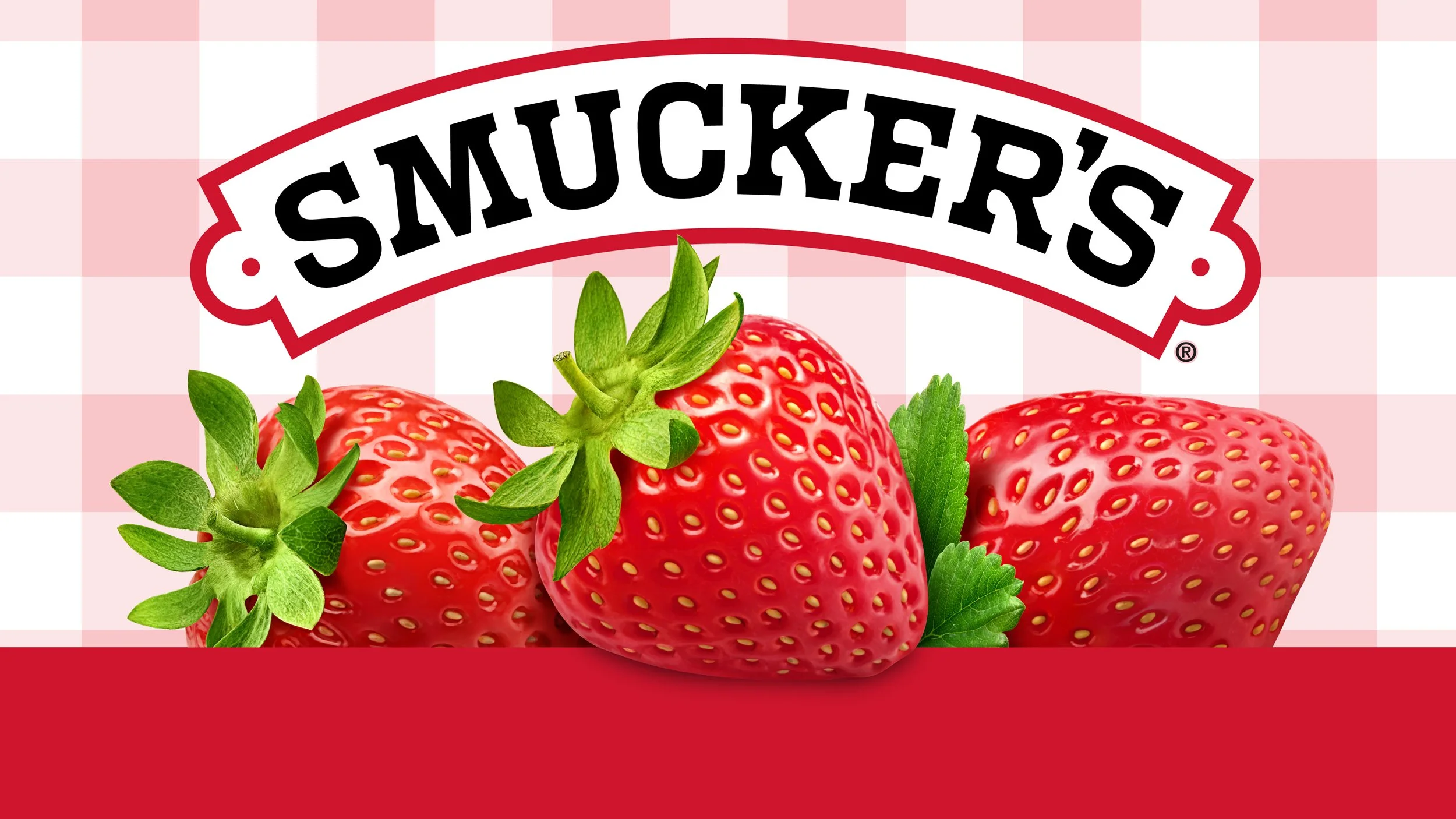
The refreshed packaging design system builds on Smucker’s most distinctive assets while creating a more vibrant, flavor-forward shelf experience. By expanding the iconic gingham beyond the lid, introducing a bold color architecture for easier flavor navigation, and elevating fruit imagery to celebrate freshness and taste, the redesign brings greater clarity, appetite appeal, and consistency across the portfolio. The result is a contemporary expression of the brand that feels brighter, more engaging, and unmistakably Smucker’s.