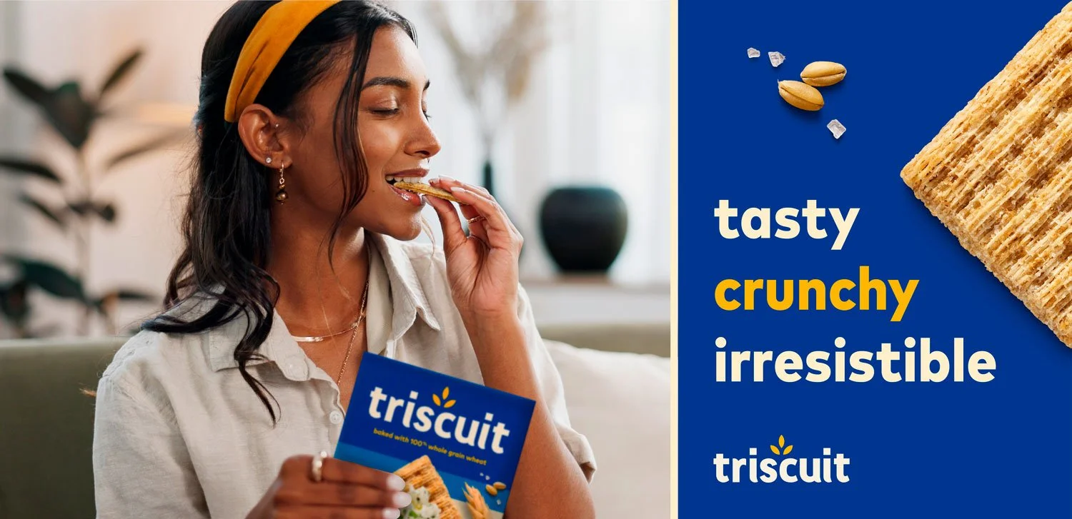
Putting Taste Center Stage
Triscuit Brand Renovation
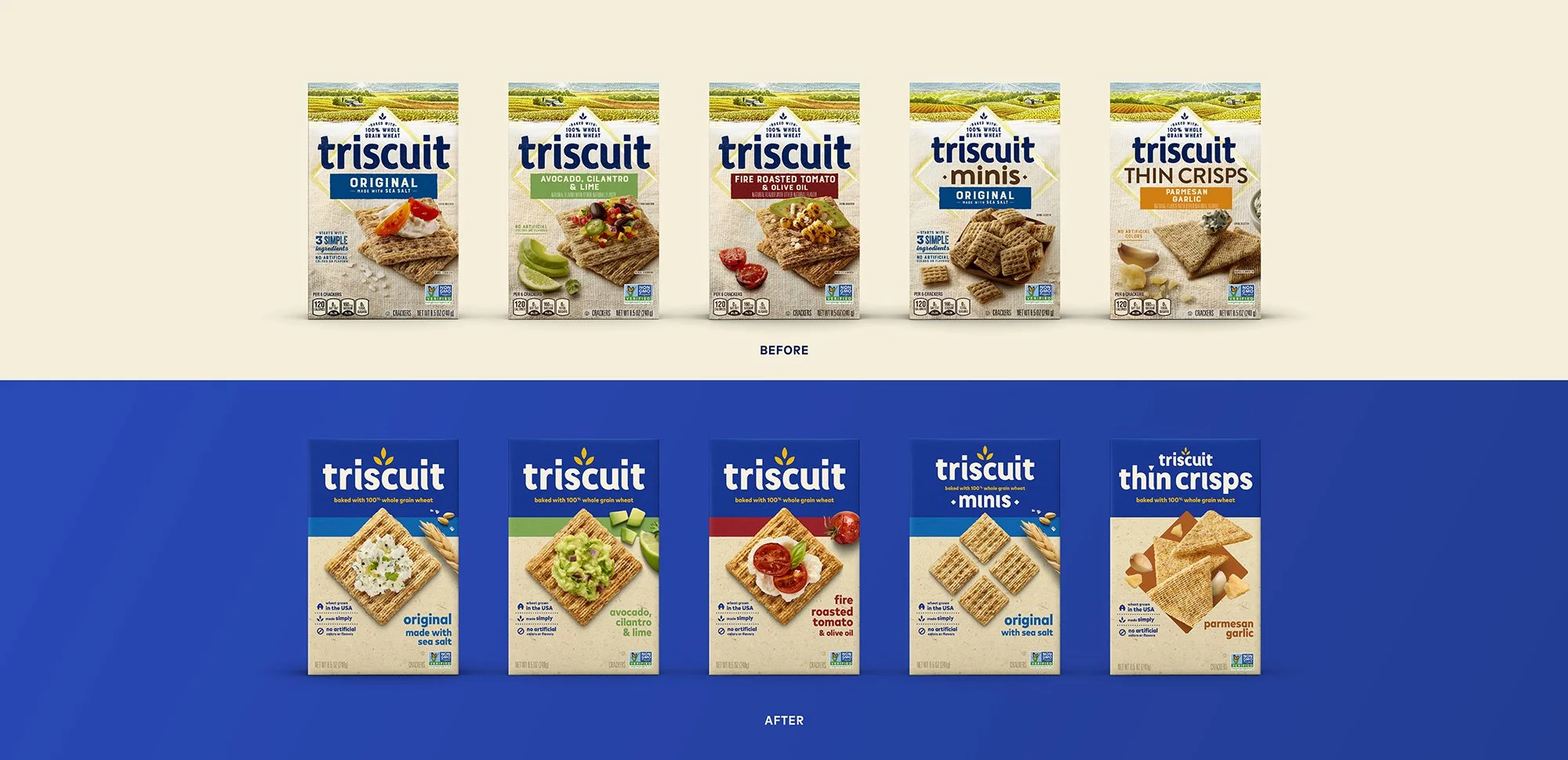
R.I.S.E. Asset Evaluation • Brand Identity • Visual Identity • Packaging • Photography • Copywriting • Brand Standards
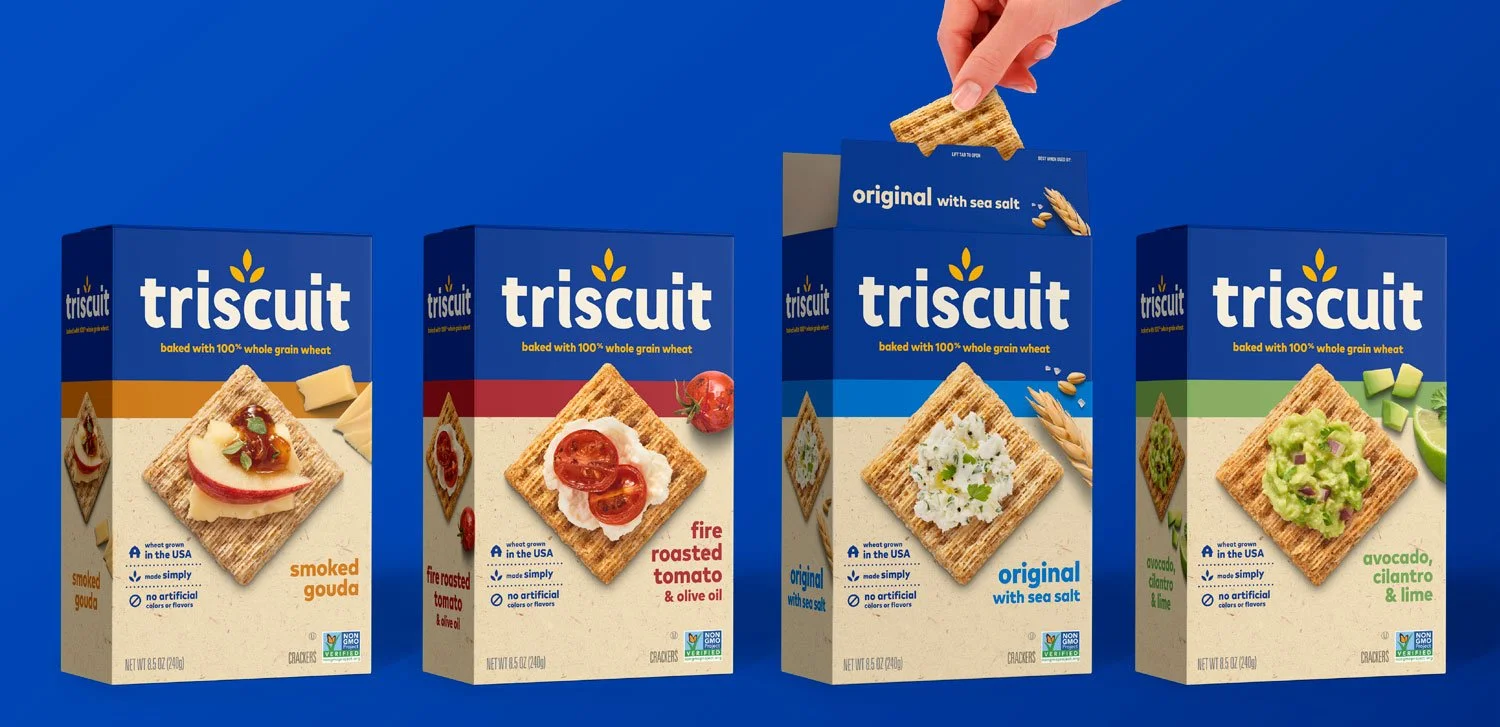
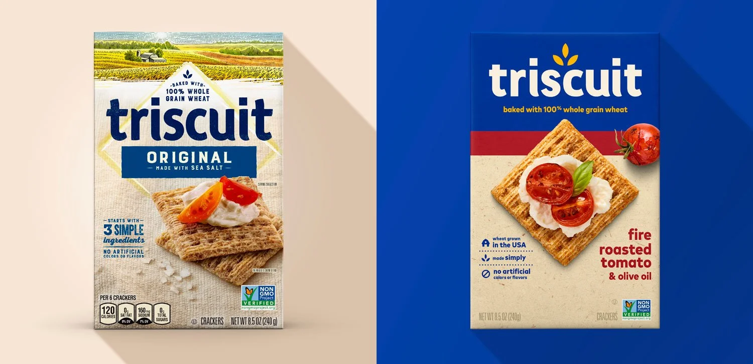
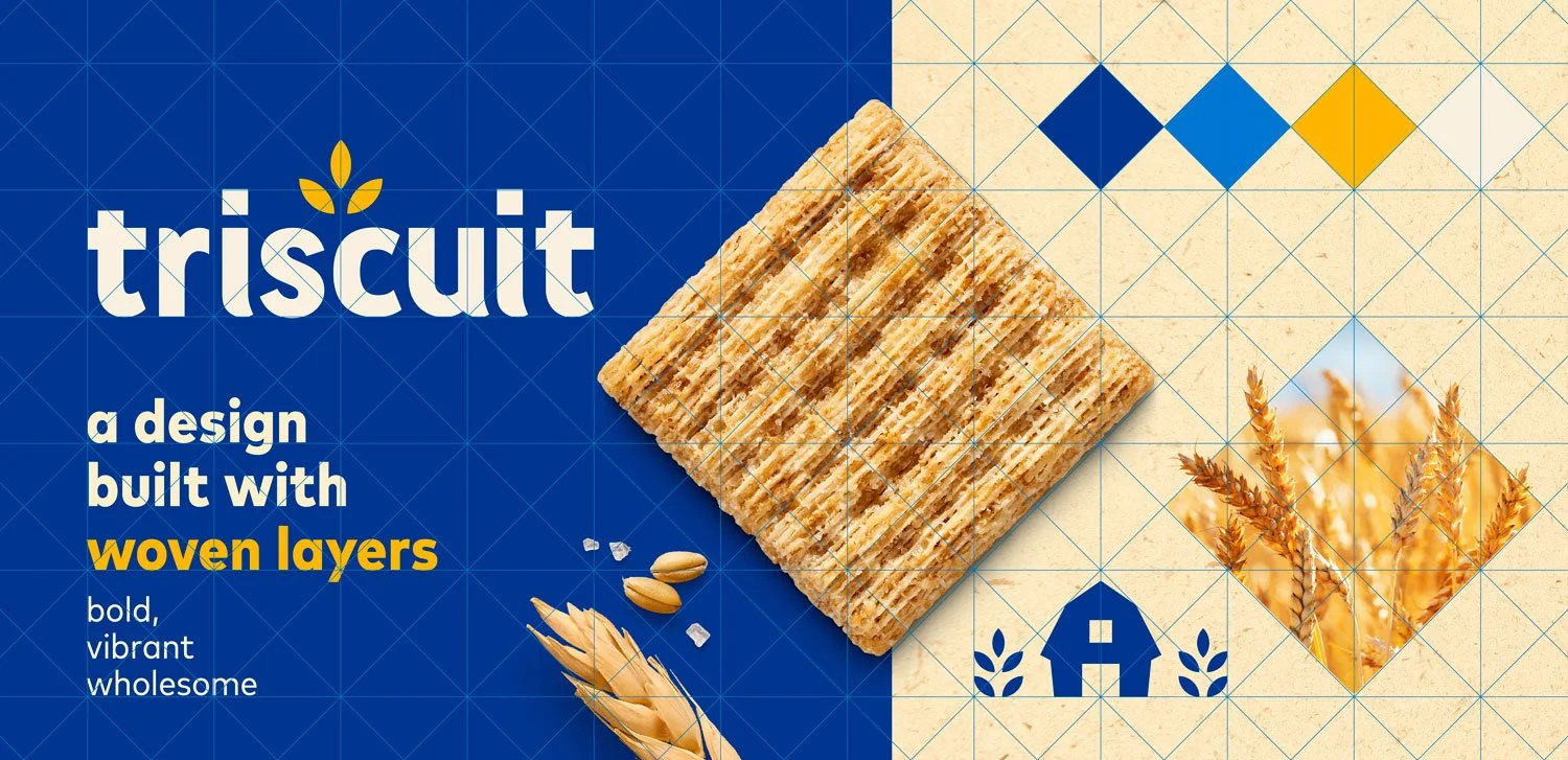
A staple of the cracker aisle, Triscuit was known for their wholesome ingredients, but was being misperceived by unfamiliar snackers as lacking flavor. The American heritage brand needed to reestablish its big taste credentials and own the shelf at retail to bring in new consumers.
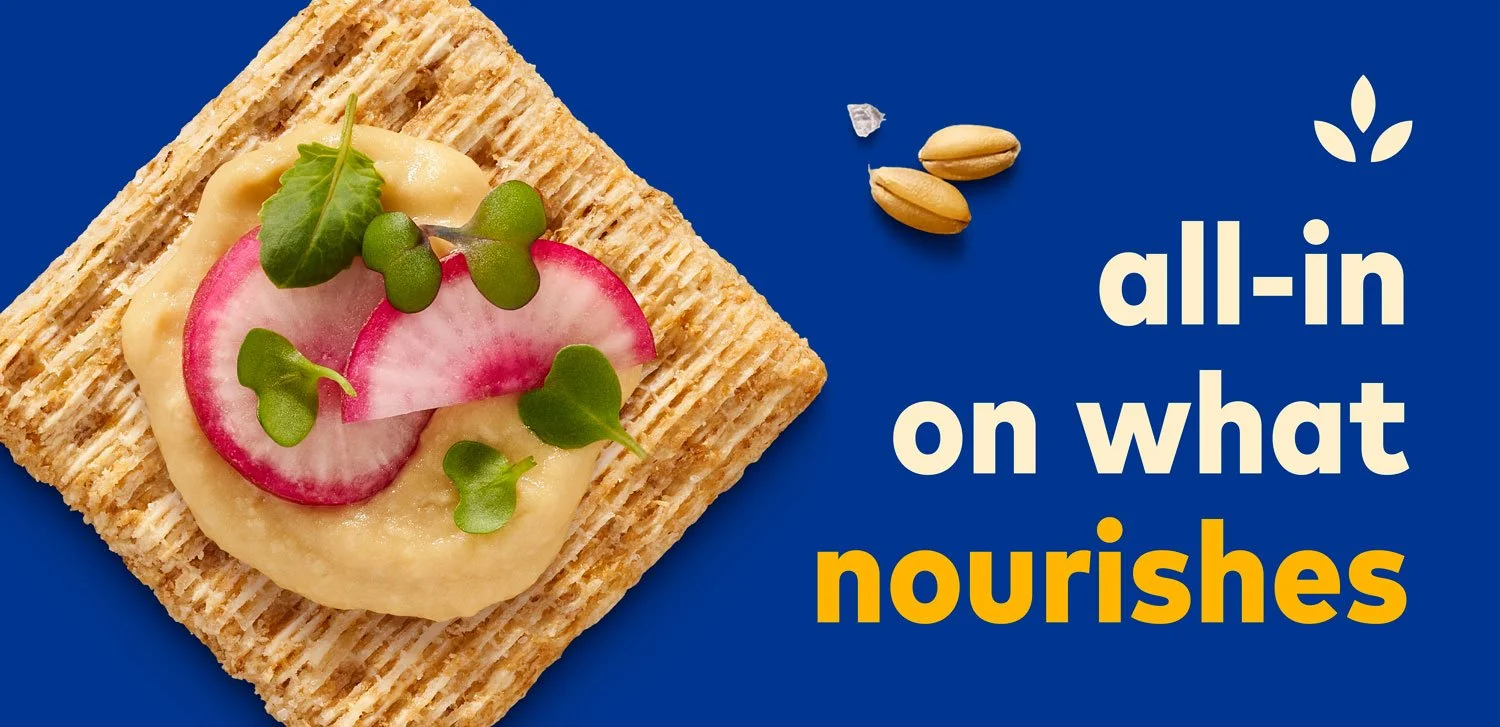
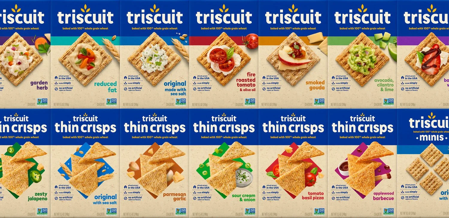
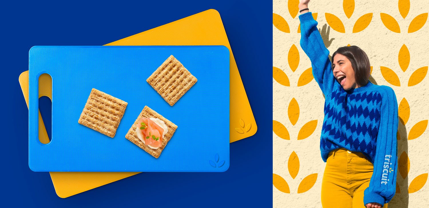
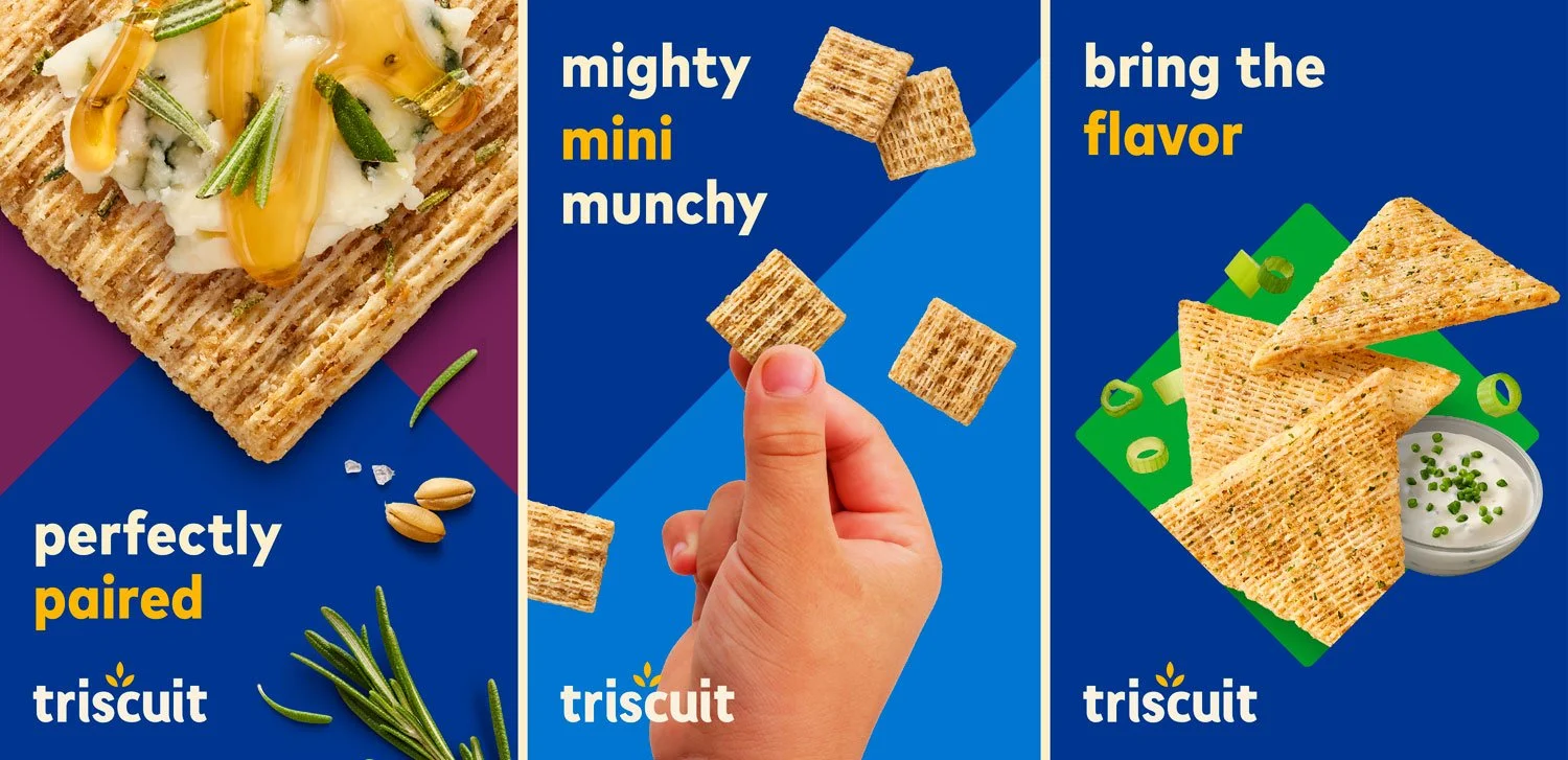
We introduced a fresh and flavor-forward visual identity and corresponding packaging design system that put the woven layers of deliciousness front and center. Amplifying appetite appeal with breakthrough impact, we powerfully united the portfolio under the masthead of Triscuit blue. The modernized expression proudly celebrates the brand’s past while appealing to the tastes of today.