Uncrustables Brand Renovation
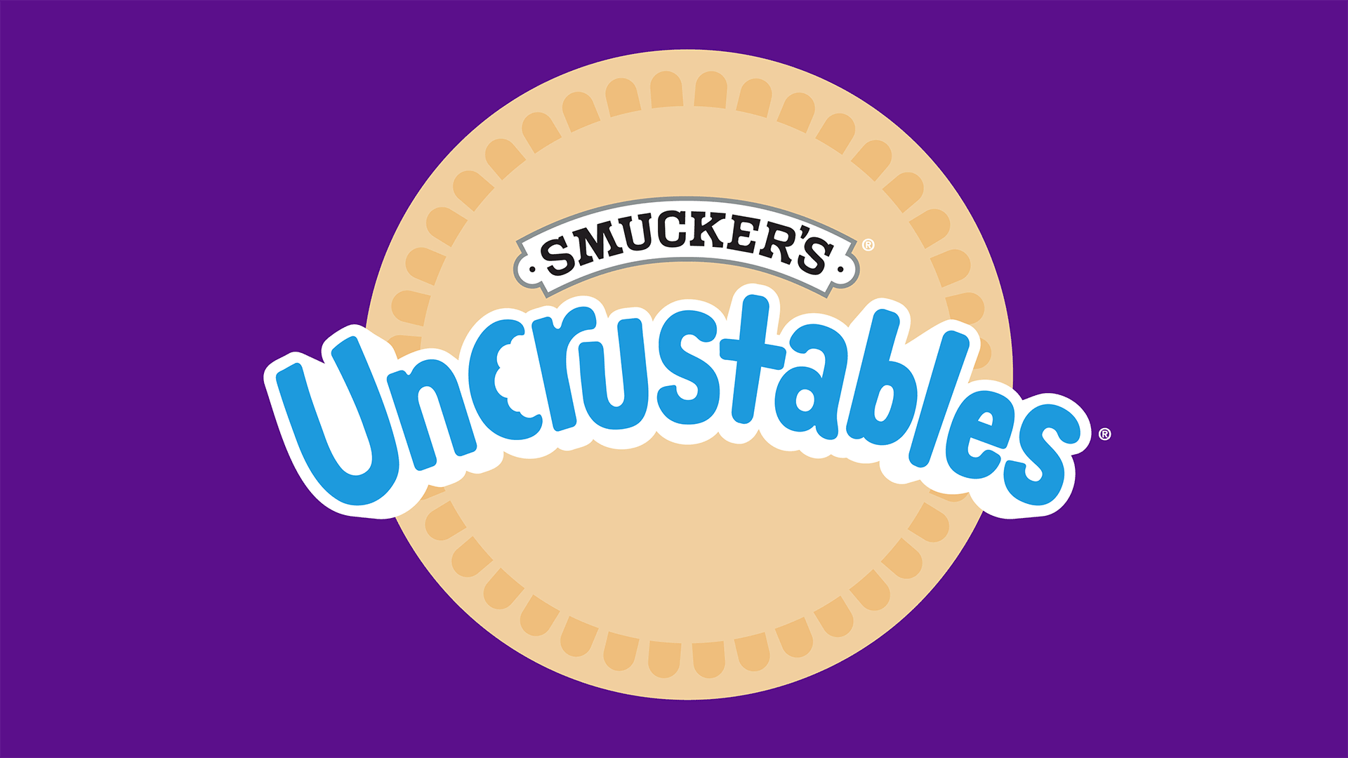
Celebrating the Circle Crimp
Brand Architecture • Brand Identity • Visual Identity • Equity Packaging • Thematic Packaging • Brand Standards
As one of the fastest growing brands in the Smucker portfolio, Uncrustables set their eye toward the next wave of growth. The brand recognized the importance of heightened distinction and celebrating what makes Uncrustables unique without losing the “two way” halo effect between the brand and master brand.
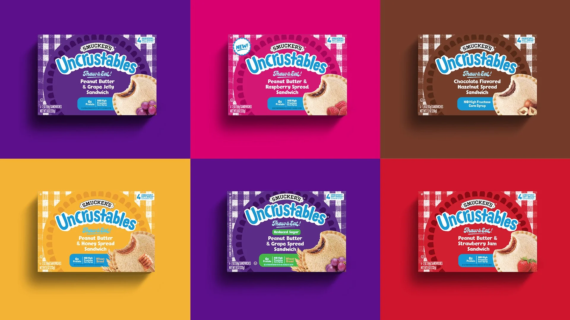
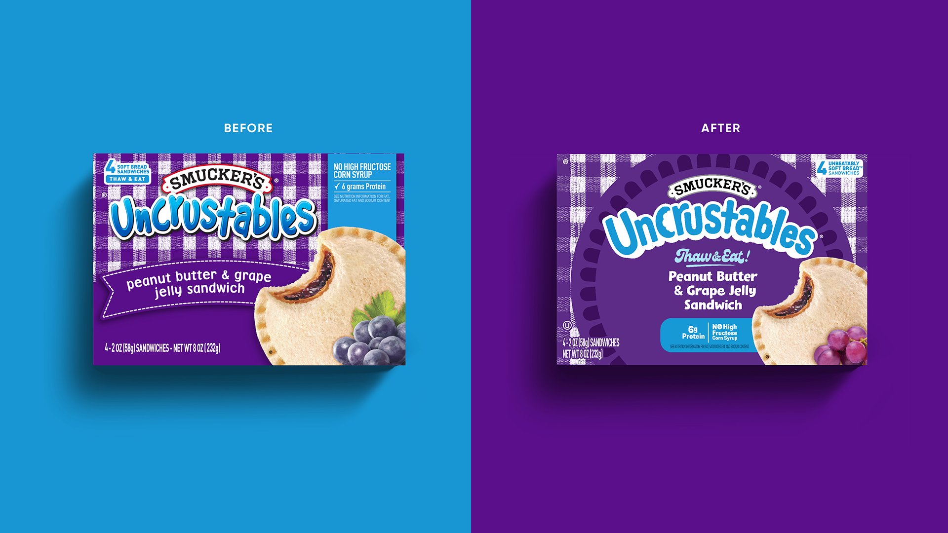
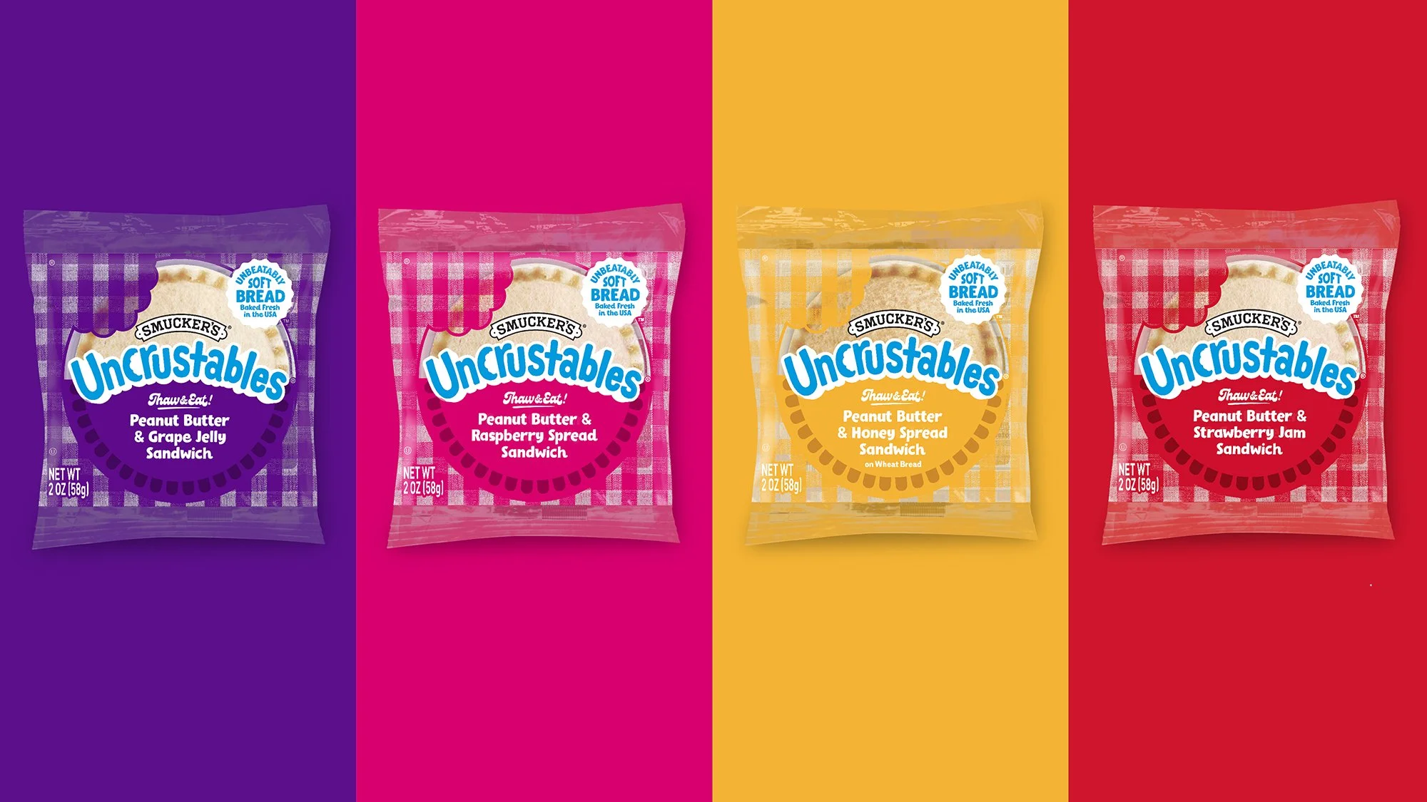
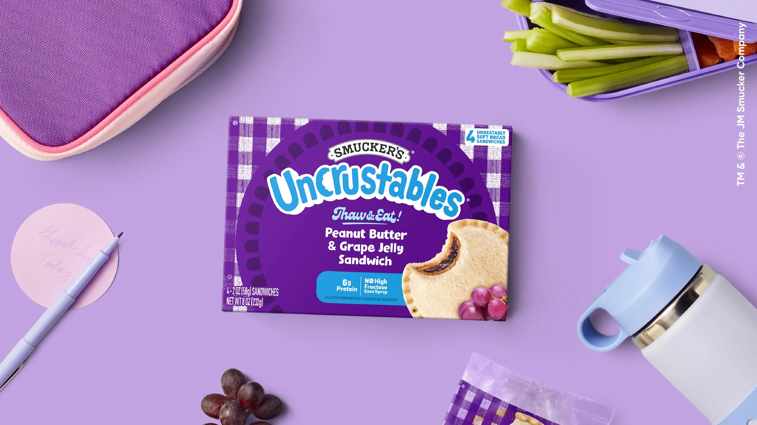
With an expanded portfolio of products and a purposeful pipeline of innovation, we began with a brand architecture that provided a strategic framework for today while also setting the brand up for tomorrow. We then leveraged our proprietary R.I.S.E. analysis tool to identify the assets we needed to retain, introduce, strengthen, and eliminate for intentional refresh. The design evolution retained distinct assets such as the gingham pattern and circle crimp sandwich. We then introduced a circle crimp bullseye to back the brand identity as well as “Thaw & Eat!” reminder for busy parents looking for an easy lunchbox solution. Even the box count was optimized, calling out the “unbeatable soft bread™️” as a point of distinction. The result was a modernized packaging design system that improved legibility, recognizability, and ownability.
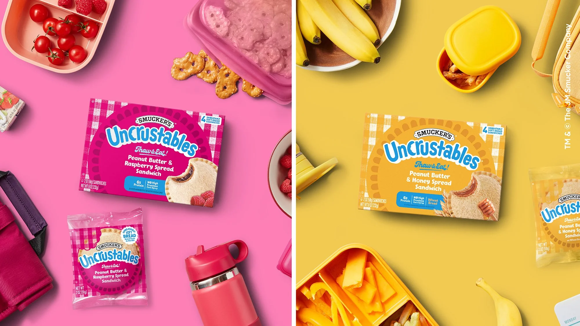
Post-redesign, we developed a thematic design system for LTOs. While the circle crimp bullseye was retained, the gingham background was replaced with a playful pattern that emanated from the brand and celebrated the season.
Results
The refreshed Uncrustables branding played an important role in the over-arching business strategy Smucker executed, supporting continued growth for the brand.
Record buyer growth. Added +4M buyers in 1st year post-launch.
Growth across all demographics – especially households with kids, Gen Z, and Millennials.